概要
今回のブログポストではTypeScriptをベースにしたNext.jsプロジェクトでUIライブラリであるMUI(Material UI)をインストールして、使う方法について説明します。
ここで紹介するソースコードは下記のリンクで確認できます。
ブログリスト
このブログポストはシリーズで作成されています。次はNext.jsのシリーズリストです。
- [Next.js] 始まる
- [Next.js] TypeScript
- [Next.js] Prettier
- [Next.js] 絶対パスでコンポーネント追加
- [Next.js] テスト
- [Next.js] Storybook
- [Next.js] Storybookのバックグラウンド変更
- [Next.js] 多言語
- [Next.js] MUI
TypeScriptベースのNext.jsプロジェクト生成
TypeScriptが適用されたNext.jsプロジェクトでMUIを使う方法について確認するため、次のコマンドを実行してTypeScriptが適用されたNext.jsプロジェクトを生成します。
npx create-next-app --typescript my-appMUIのインストール
Next.jsプロジェクトでMUIを使う方法を確認するため、MUIとEmotionをインストールする必要があります。
EmotionはCSS-in-JSライブラリで、MUIはEmotionをベースにして開発されたので一緒にインストールする必要があります。次のコマンドを実行してMUIとEmotionをインストールします。
npm install --save @emotion/react @emotion/styled @mui/icons-material @mui/material使い方
簡単にMUIが提供するボタンコンポーネントを画面に表示してみて、MUIの使い方を確認してみましょう。./pages/index.tsxファイルを開いて下記のように修正します。
...
import { Stack, Button } from '@mui/material'

const Home: NextPage = () => {
  return (
    <div className={styles.container}>
      ...
      <main className={styles.main}>
        <h1 className={styles.title}>
          Welcome to <a href="https://nextjs.org">Next.js!</a>
        </h1>

        <Stack spacing={2} direction="row">
          <Button variant="text">Text</Button>
          <Button variant="contained">Contained</Button>
          <Button variant="outlined">Outlined</Button>
        </Stack>
        ...
      </main>
      ...
    </div>
  )
}

export default Homeそして次のコマンドを実行してNext.jsプロジェクトを実行します。
npm run devプロジェクトが実行されたら、ウェブブラウザでhttp://localhost:3000を開いてみると次のように私たちが追加したボタンが表示されることが確認できます。

MUIが提供するコンポーネントを使う方法は一般的なコンポーネントを使う方法と同じなので、簡単に使えます。MUIで提供する全てのコンポーネントは下記のリンクで確認できます。
テーマの設定
MUIを使う時、テーマを使ってアプリの全般的な色を決めることができます。MUIで使えるテーマのリストは次のリンクで確認できます。
そしたらMUIのテーマを使う方法について確認するため、./theme.tsxファイルを生成して次のように修正します。
import { createTheme } from '@mui/material/styles';

export const theme = createTheme({
  palette: {
    primary: {
      main: '#ff8e88',
    },
  },
});lこのように生成したテーマをNext.jsプロジェクトに適用するため./pages/_app.tsxファイルを開いて下記のように修正します。
...
import { ThemeProvider } from '@mui/material'
import { theme } from '../theme'

function MyApp({ Component, pageProps }: AppProps) {
  return (
    <ThemeProvider theme={theme}>
      <Component {...pageProps} />
    </ThemeProvider>
  )
}そして、再びhttp://localhost:3000をウェブブラウザで確認すると次のようにテーマが上手く反映されたことが確認できます。

Storybookの設定
StorybookでもMUIのテーマを適用してMUIのコンポーネントを使うためにはStorybookを設定する必要があります。StorybookをNext.jsプロジェクトに適用する方法については以前のブログポストを参考してください。
StorybookもEmotionに依存していて、MUIもEmotionに依存してます。したがって、StorybookのEmotion機能を使えないようにする必要があります。./.storybook/main.jsファイルを開いて下記のように修正します。
module.exports = {
  ...
  framework: '@storybook/react',
  features: {
    emotionAlias: false,
  },
};そしてStorybookのMUIテーマを適用するため./.storybook/preview.jsファイルの名前を./.storybook/preview.tsxに変更した後、次のように修正します。
import { ThemeProvider } from '@mui/material'

import { theme } from '../theme'
export const decorators = [
  (Story) => (
    <ThemeProvider theme={theme}>
      <Story />
    </ThemeProvider>
  ),
]

export const parameters = {
  ...
}次は./stories/SampleButton.tsxファイルを開いて下記のように修正します。
import { Button } from '@mui/material';

interface Props {
  readonly color?: 'primary' | 'secondary' | undefined
  readonly backgroundColor?: string
  readonly size?: 'small' | 'medium' | 'large'
  readonly label: string
  readonly onClick?: () => void
}

export const SampleButton = ({
  color = 'primary',
  size = 'medium',
  backgroundColor,
  label,
  onClick,
}: Props) => {
  return (
    <Button
      variant="contained"
      color={color}
      size={size}
      style={{ backgroundColor }}
      onClick={onClick}>
      {label}
    </Button>
  )
}最後に./stories/SampleButton.stories.tsxファイルを生成して次のように修正します。
import React from 'react'
import { ComponentStory, ComponentMeta } from '@storybook/react'

import { SampleButton } from './SampleButton'

export default {
  title: 'SampleButton',
  component: SampleButton,
} as ComponentMeta<typeof SampleButton>

const Template: ComponentStory<typeof SampleButton> = (args) => (
  <SampleButton {...args} />
)

export const Primary = Template.bind({})
Primary.args = {
  color: 'primary',
  label: 'Button',
}

export const Secondary = Template.bind({})
Secondary.args = {
  color: 'secondary',
  label: 'Button',
}

export const Large = Template.bind({})
Large.args = {
  size: 'large',
  label: 'Button',
}

export const Small = Template.bind({})
Small.args = {
  size: 'small',
  label: 'Button',
}次は下記のコマンドを使ってStorybookを実行します。
npm run storybookStorybookが実行されるとhttp://localhost:6006/をウェブブラウザで開いてみると、次のような画面が確認できます。
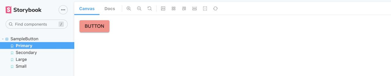
Storybookで私たちが作ったSampleButtonを選択すると、MUIのテーマが適用されたButtonコンポーネントが確認できます。
完了
今回のブログポストではTypeScriptをベースにしたNext.jsプロジェクトにMUIをインストールして使う方法についてみてみました。また、StorybookにMUIのテーマを適用する方法も確認しました。
私のブログが役に立ちましたか?下にコメントを残してください。それは私にとって大きな大きな力になります!
アプリ広報
Dekuが開発したアプリを使ってみてください。Dekuが開発したアプリはFlutterで開発されています。興味がある方はアプリをダウンロードしてアプリを使ってくれると本当に助かります。