Contents
Outline
In this blog post, I will introduce how to use Storybook for Component Driven Development in the Next.js project based on TypeScript.
You can see the full source code of this blog post on the following link.
Blog list
This blog post is a series. If you want to check other blog posts of the series, see the links below.
- [Next.js] Getting Started
- [Next.js] TypeScript
- [Next.js] Prettier
- [Next.js] Absolute path
- [Next.js] Test
- [Next.js] Storybook
- [Next.js] Change Storybook background color
- [Next.js] Localization
- [Next.js] MUI
Create Next.js project with TypeScript
To use Storybook in the Next.js project based on TypeScript, execute the following command to create a new Next.js project with TypeScript.
npx create-next-app --typescript start-storybookInstall Storybook
To use Storybook for Component Driven Development in the Next.js project, we need to install Storybook. Execute the following command to install Storybook.
# cd start-storybook
npm install --save-dev sb
Initialize Storybook
To use Storybook, we need to initialize Storybook to install required libraries. Execute the following command to initialize Storybook.
npx sb init --builder webpack5And then, you can see Storybook is initialized automatically like the below.
 sb init - the simplest way to add a Storybook to your project.

 • Detecting project type. ✓

    There seems to be a Storybook already available in this project.
    Apply following command to force:

   sb init [options] -f

🔎 checking 'cra5'
🔎 checking 'webpack5'
🔎 checking 'angular12'
🔎 checking 'mainjsFramework'
Unable to find storybook main.js config, skipping
🔎 checking 'eslintPlugin'
Lastly, you can see a question like the below.
? Do you want to run the 'eslintPlugin' fix on your project? › (y/N)If you use ESLint to check the code style, press the y key to proceed. If not, press the N key to skip. In this blog post, I pressed the y key for proceeding.
And then, Storybook installs the required libraries and writes the execution script to the package.json automatically like the below.
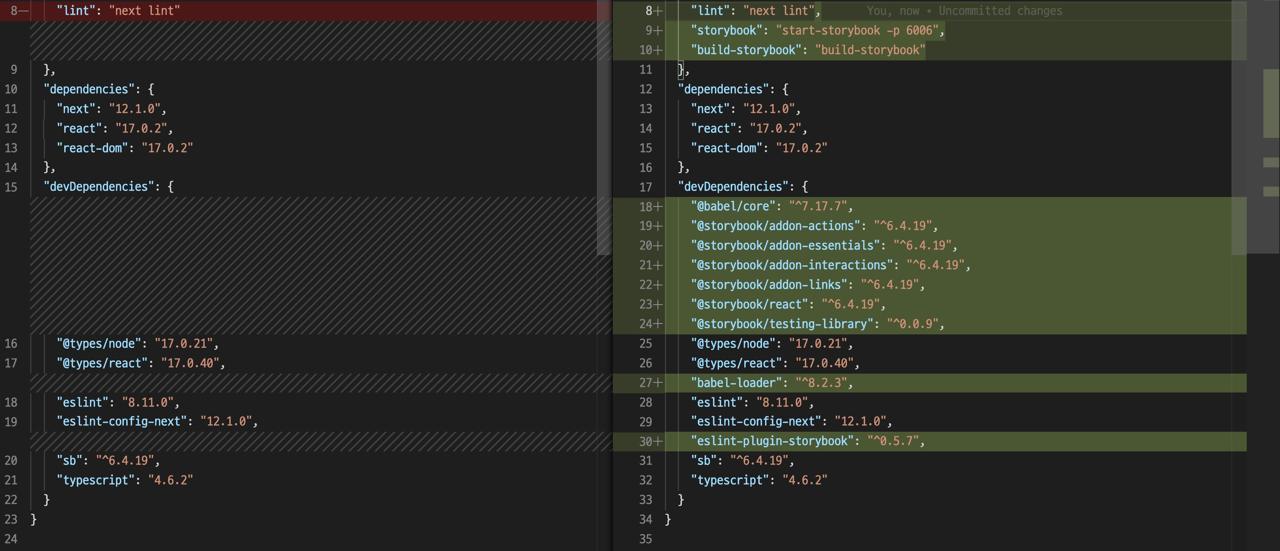
{
   ...
   "scripts": {
    ...
    "storybook": "start-storybook -p 6006",
    "build-storybook": "build-storybook"
  },
  ...
  "devDependencies": {
    "@babel/core": "^7.17.7",
    "@storybook/addon-actions": "^6.4.19",
    "@storybook/addon-essentials": "^6.4.19",
    "@storybook/addon-interactions": "^6.4.19",
    "@storybook/addon-links": "^6.4.19",
    "@storybook/react": "^6.4.19",
    "@storybook/testing-library": "^0.0.9",
    "babel-loader": "^8.2.3",
    "eslint-plugin-storybook": "^0.5.7",
    ...
  }
}
Also, to show how to use Storybook, Storybook creates the configuration files and sample codes like the below.
./.storybook/...: Configuration files forStorybook../stories/...: Sample codes forStorybook.
configure public folder
To make Storybook recognize the public folder that includes the static files in Next.js, modify the scripts like the below.
{
   ...
   "scripts": {
    ...
    "storybook": "start-storybook -p 6006 -s ./public",
    "build-storybook": "build-storybook -s public"
  },
  ...
}
Execute Storybook
To check Storybook is installed and configured well, let’s try to execute Storybook. Execute the following command to execute Storybook.
npm run storybookAnd then, the browser will open automatically with http://localhost:6006 and you can see the screen like the below.
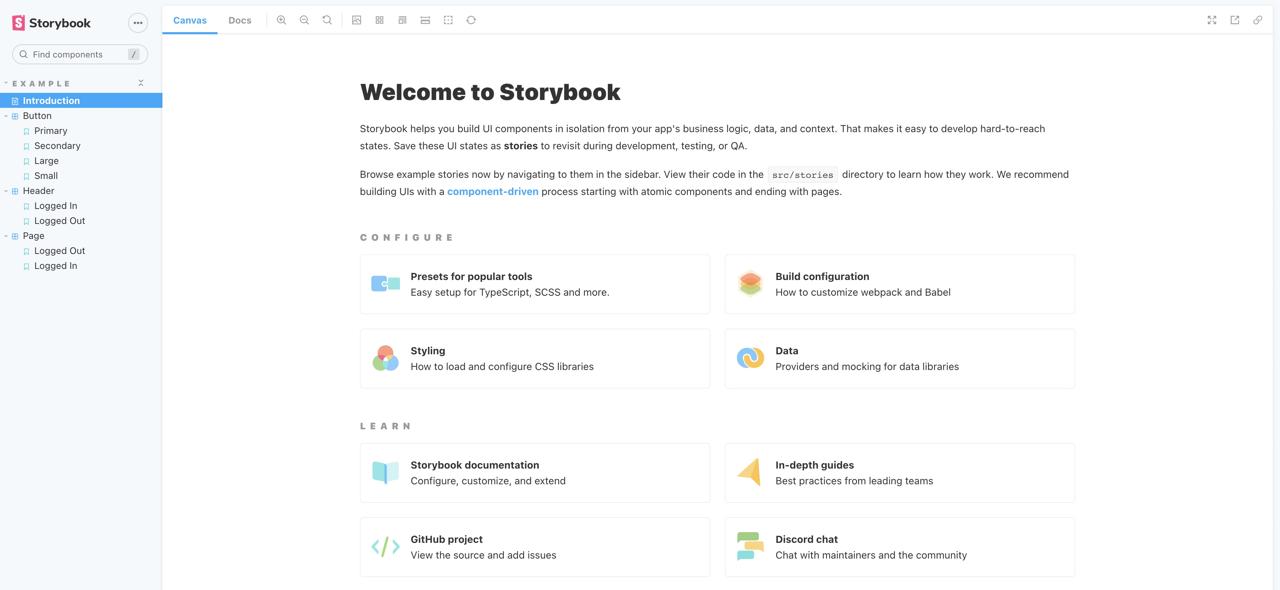
This page content is from the ./stories/Introduction.stories.mdx file.
Check Storybook
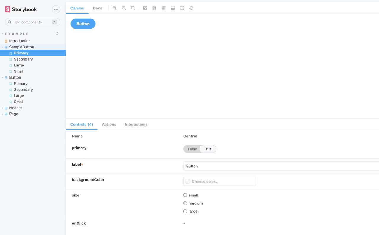
When you click the Button > Primary on the left of the screen in Storybook, you can see the screen like the below.
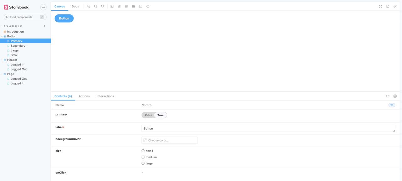
This page content is from the ./stories/Button.stories.tsx file.
Check sample code
To see more details, let’s see the sample code. The Button component(./stories/Button.tsx) is like the following.
import React from 'react';
import './button.css';

interface ButtonProps {
  primary?: boolean;
  backgroundColor?: string;
  size?: 'small' | 'medium' | 'large';
  label: string;
  onClick?: () => void;
}

export const Button = ({
  primary = false,
  size = 'medium',
  backgroundColor,
  label,
  ...props
}: ButtonProps) => {
  ...
};
As you can see, the Button component has various Props like primary and backgroundColor. Next, the Storybook file(./stories/Button.stories.tsx) is like the following.
import React from 'react';
import { ComponentStory, ComponentMeta } from '@storybook/react';

import { Button } from './Button';

export default {
  title: 'Example/Button',
  component: Button,
  argTypes: {
    backgroundColor: { control: 'color' },
  },
} as ComponentMeta<typeof Button>;

const Template: ComponentStory<typeof Button> = (args) => <Button {...args} />;

export const Primary = Template.bind({});
Primary.args = {
  primary: true,
  label: 'Button',
};

export const Secondary = Template.bind({});
Secondary.args = {
  label: 'Button',
};

export const Large = Template.bind({});
Large.args = {
  size: 'large',
  label: 'Button',
};

export const Small = Template.bind({});
Small.args = {
  size: 'small',
  label: 'Button',
};
First, you need to prepare the component to show it on Storybook.
import React from 'react';
import { ComponentStory, ComponentMeta } from '@storybook/react';
import { Button } from './Button';
export default {
title: 'Example/Button',
component: Button,
argTypes: {
backgroundColor: { control: 'color' },
},
} as ComponentMeta<typeof Button>;
const Template: ComponentStory<typeof Button> = (args) => <Button {...args} />;
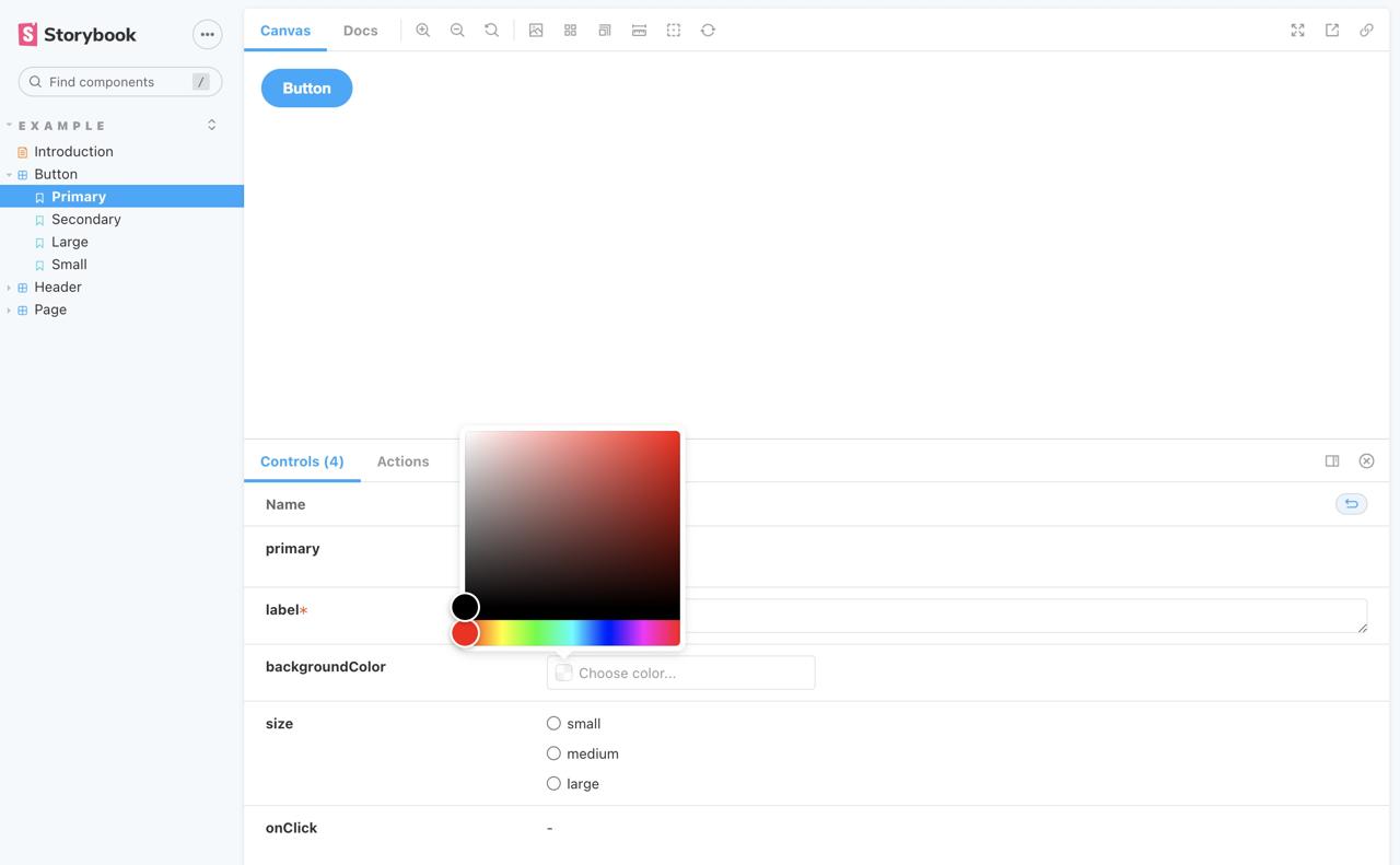
...When you configure control: 'color' to backgroundColor in argTypes, you can see the color picker on Storybook like the below.
And then, you need to write Story.
...
export const Primary = Template.bind({});
Primary.args = {
  primary: true,
  label: 'Button',
};
...
You can create Story to set the Props of the Button component to args in here.
Configure Storybook
First, we need to configure Storybook to use globals.css of Next.js. Open the ./storybook/preview.js file and modify it like the below.
import '../styles/globals.css'

export const parameters = {
  ...
}
Currently, we can only write the Story in the ./stories folder. However, we normally create and manage the components in the ./components folder or others.
If you want to create Story to other folder, you should modify the ./.storybook/main.js file. Open the ./.storybook/main.js file and modify it like the below.
module.exports = {
  "stories": [
    "../**/*.stories.mdx",
    "../**/*.stories.@(js|jsx|ts|tsx)"
  ],
  ...
}
From now, you can write Story with the .stories.tsx file extension in any folder and Storybook recognizes them to show them. To check it, Create the ./components/SampleButton folder, and copy and rename the following files.
./stories/button.css>./components/SampleButton/index.css./stories/Button.stories.tsx>./components/SampleButton/index.stories.tsx./stories/Button.tsx>./components/SampleButton/index.tsx
And, open the ./components/SampleButton/index.tsx file and modify it like the below.
...
import './index.css';
...
export const SampleButton = ({
   ...
}: ButtonProps) => {
   ...
};
And, open the ./components/SampleButton/index.stories.tsx file and modify it like the below.
...
import { SampleButton } from '.';
...
export default {
  title: 'Example/SampleButton',
  component: SampleButton,
  ...,
} as ComponentMeta<typeof SampleButton>;

const Template: ComponentStory<typeof SampleButton> = (args) => (
  <SampleButton {...args} />
);
...
We’ve modified the Storybook configuration, so we need to restart Storybook to apply it. When you restart Storybook, you can see the SampleButton component in the Storybook screen like the below.
Complete
Done! we’ve seen how to install and configure Storybook for Component Driven Development in the Next.js project based on TypeScript. From now, when you develop an app, you can focus to develop the components with Storybook.
Was my blog helpful? Please leave a comment at the bottom. it will be a great help to me!
App promotion
Deku.Deku created the applications with Flutter.If you have interested, please try to download them for free.