Contents
Outline
I try to develop an app with Flutter. In this blog post, I will show you how to get the user input in Flutter.
You can see the full source code of this blog post on the link below.
Create Flutter project
We need to use the TextField widget to get the user input in Flutter. For checking it, execute the command below to create a new Flutter project.
flutter create my_app
cd my_app
TextField
After creating the project, open the main.dart file and modify it like below to display the TextField widget.
import 'package:flutter/material.dart';

void main() {
  runApp(MyApp());
}

class MyApp extends StatelessWidget {
  @override
  Widget build(BuildContext context) {
    return MaterialApp(
      title: 'Flutter Demo',
      theme: ThemeData(
        primarySwatch: Colors.blue,
      ),
      debugShowCheckedModeBanner: false,
      home: Home(),
    );
  }
}

class Home extends StatelessWidget {
  @override
  Widget build(BuildContext context) {
    return Scaffold(
      appBar: AppBar(
        title: Text('TextField'),
      ),
      body: Center(
        child: Padding(
          child: TextField(
            decoration: InputDecoration(
              labelText: 'Input',
            ),
          ),
          padding: EdgeInsets.all(20.0),
        ),
      ),
    );
  }
}
If you write the code above, you can see the result like below..
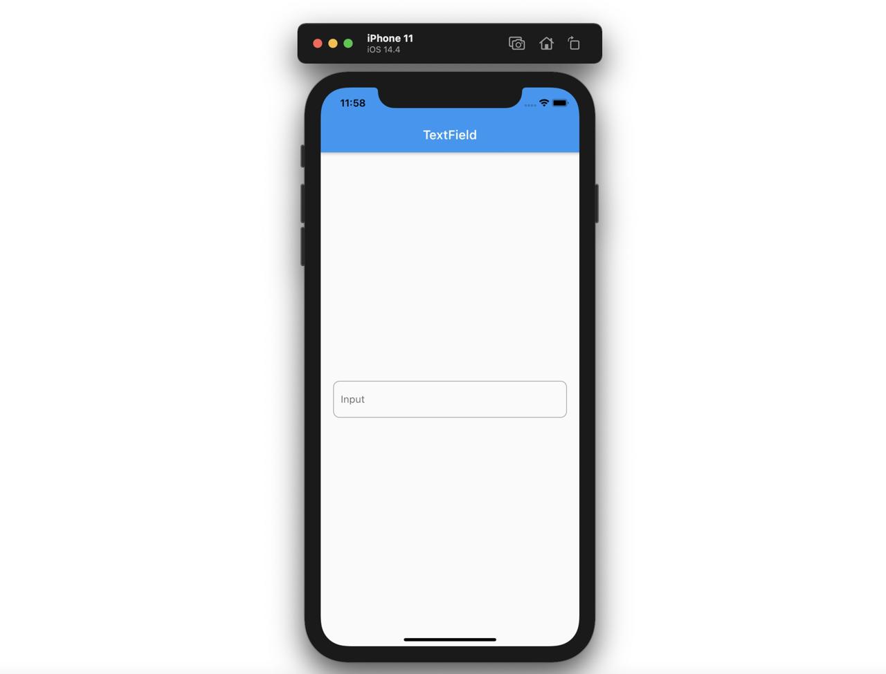
Let’s see the details about using the TextField widget.
TextField(
  decoration: InputDecoration(
    labelText: 'Input',
  ),
)
We can display the TextField as above, and we can use some configurations to set the InputDecoration to the decoration parameter.
InputDecoration
If you configure the InputDecoration, you can make the various types of TextField widget.
TextField(
  decoration: InputDecoration(
    labelText: 'Email',
    hintText: 'Enter your email',
    labelStyle: TextStyle(color: Colors.redAccent),
    focusedBorder: OutlineInputBorder(
      borderRadius: BorderRadius.all(Radius.circular(10.0)),
      borderSide: BorderSide(width: 1, color: Colors.redAccent),
    ),
    enabledBorder: OutlineInputBorder(
      borderRadius: BorderRadius.all(Radius.circular(10.0)),
      borderSide: BorderSide(width: 1, color: Colors.redAccent),
    ),
    border: OutlineInputBorder(
      borderRadius: BorderRadius.all(Radius.circular(10.0)),
    ),
  ),
  keyboardType: TextInputType.emailAddress,
)
When you use the InputDecoration as above, you can see the designed TextField like below.
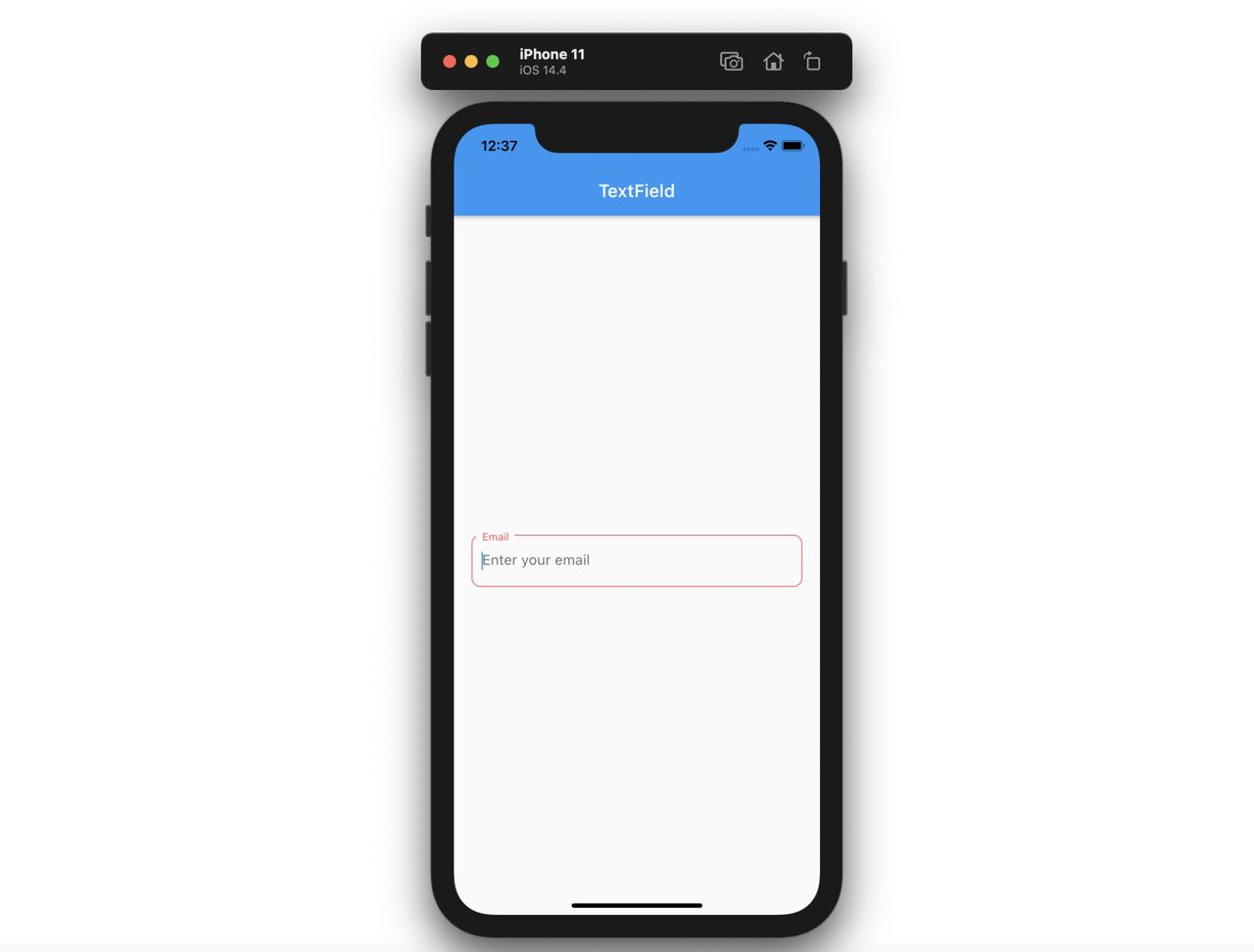
SingleChildScrollView
When we use the TextField widget and the keyboard is activated, there is no problem like below.
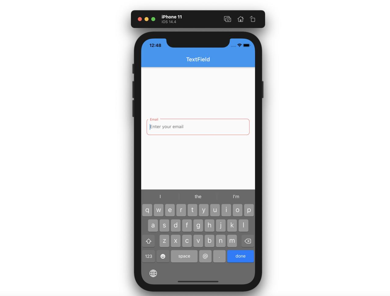
However, we normally use the TextField widget with the Column widget to design the app.
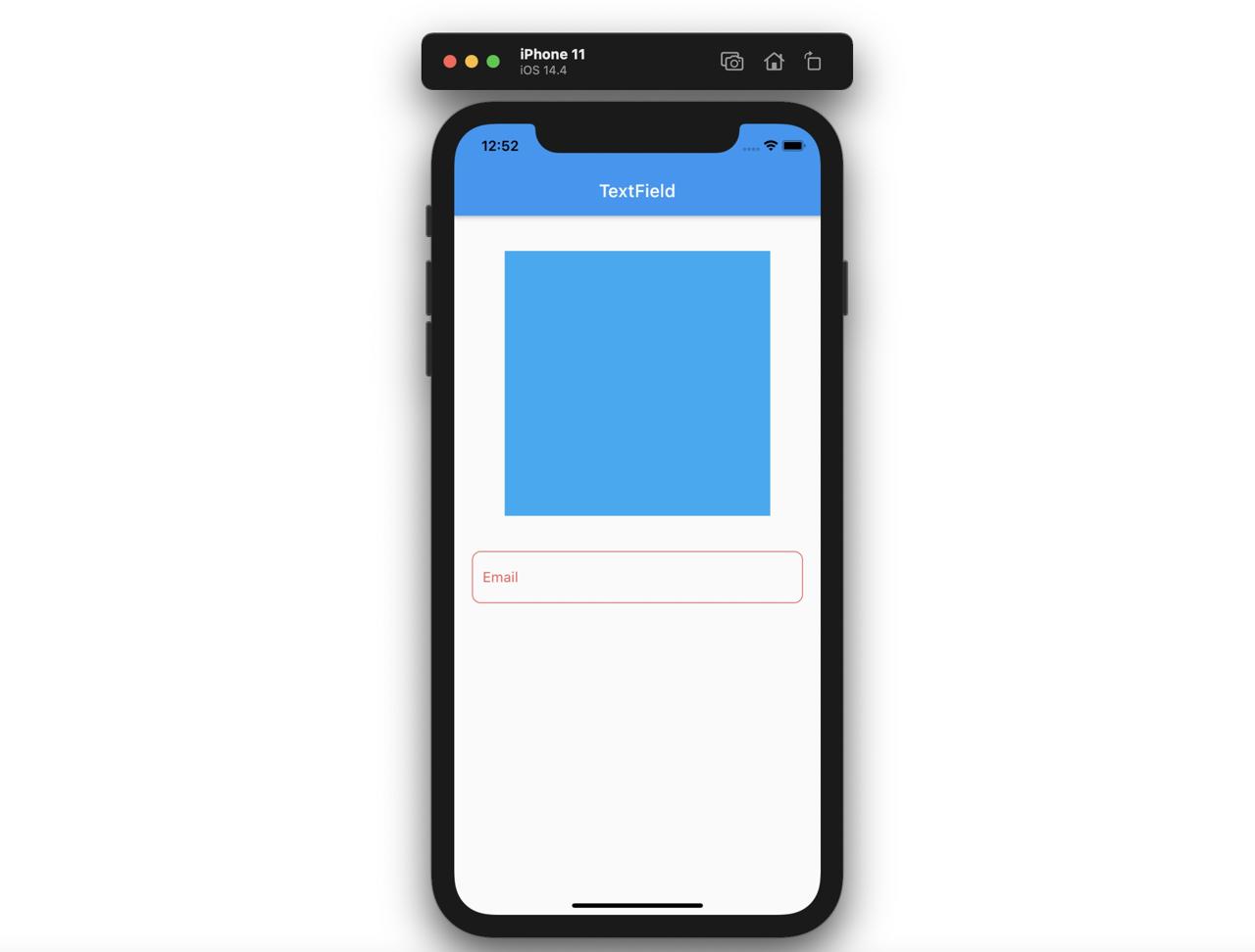
At this time, if the keyboard covers the Column area, you can see the warning like below.
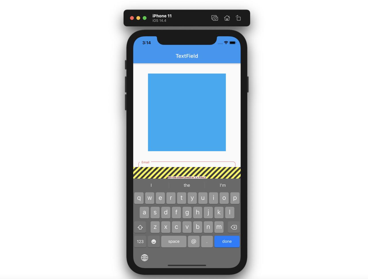
To solve this issue, we can use the SingleChildScrollView widget.
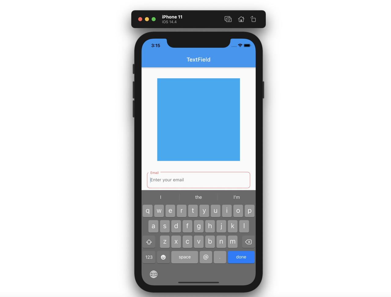
You can solve the problem by using the SingleChildScrollView widget like below.
SingleChildScrollView(
  child: Column(
    children: [
      Container(
        width: 300,
        height: 300,
        margin: EdgeInsets.all(40.0),
        color: Colors.lightBlue,
      ),
      Padding(
        padding: EdgeInsets.fromLTRB(20.0, 0.0, 20.0, 10.0),
        child: TextField(
          decoration: InputDecoration(
            labelText: 'Email',
            hintText: 'Enter your email',
            labelStyle: TextStyle(color: Colors.redAccent),
            focusedBorder: OutlineInputBorder(
              borderRadius: BorderRadius.all(Radius.circular(10.0)),
              borderSide: BorderSide(width: 1, color: Colors.redAccent),
            ),
            enabledBorder: OutlineInputBorder(
              borderRadius: BorderRadius.all(Radius.circular(10.0)),
              borderSide: BorderSide(width: 1, color: Colors.redAccent),
            ),
            border: OutlineInputBorder(
              borderRadius: BorderRadius.all(Radius.circular(10.0)),
            ),
          ),
          keyboardType: TextInputType.emailAddress,
        ),
      ),
    ],
  ),
)
If you use the SingleChildScrollView widget, when the keyboard is activated, the screen will be scrollable.
GestureDetector와 FocusScope
In current state, we need to press the done button to hide the keyboard. In other words, when the TextField gets the Focus, the keyboard is activated, and when the done key is pressed, the TextField gets the UnFocus and the keyboard is disappeared.
In the normal app’s UX of the keyboard activation, when the other area than the keyboard is pressed, the keyboard is disappeared. To make the keyboard is disappeared when the other area than the keyboard is pressed, we need to use the GestureDetector widget and the FocusScope widget.
Let’s open the main.dart file and modify it like below to hide the keyboard.
GestureDetector(
  onTap: () => FocusScope.of(context).unfocus(),
  child: SingleChildScrollView(...),
),
I skip to explain the code in the SingleChildScrollView widget. It’s the same code with above. First, we need to use the GestureDetector widget to detect the user events. At this time, when the user touches the screen, to remove the keyboard Focus, I used the unfocus function of FocusScope widget.
when you use the GestureDetector and FocusScope, you can hide
이렇게 GestureDetector와 FocusScope를 사용하면, 키보드를 감추는 기능을 만들 수 있다.
How to use the TextField value
We use the TextField widget to get the user input and use the value. So, let’s see how to get and use the TextField value.
onChanged
When the user inserts the value in the TextField, the onChanged function of the TextField widget is called. At this time, the user input is passed via the text parameter, and we can use it with setState.
class Home extends StatefulWidget {
  @override
  _HomeState createState() => _HomeState();
}

class _HomeState extends State<Home> {
  String inputText = '';

  @override
  Widget build(BuildContext context) {
    return Scaffold(
      appBar: AppBar(
        title: Text('TextField'),
      ),
      body: Center(
        child: GestureDetector(
          onTap: () => FocusScope.of(context).unfocus(),
          child: SingleChildScrollView(
            child: Column(
              children: [
                Text('$inputText'),
                Padding(
                  padding: EdgeInsets.fromLTRB(20.0, 0.0, 20.0, 10.0),
                  child: TextField(
                    onChanged: (text) {
                      setState(() {
                        inputText = text;
                      });
                    },
                    decoration: InputDecoration(
                      labelText: 'Email',
                      hintText: 'Enter your email',
                      labelStyle: TextStyle(color: Colors.redAccent),
                      focusedBorder: OutlineInputBorder(
                        borderRadius: BorderRadius.all(Radius.circular(10.0)),
                        borderSide:
                            BorderSide(width: 1, color: Colors.redAccent),
                      ),
                      enabledBorder: OutlineInputBorder(
                        borderRadius: BorderRadius.all(Radius.circular(10.0)),
                        borderSide:
                            BorderSide(width: 1, color: Colors.redAccent),
                      ),
                      border: OutlineInputBorder(
                        borderRadius: BorderRadius.all(Radius.circular(10.0)),
                      ),
                    ),
                    keyboardType: TextInputType.emailAddress,
                  ),
                ),
              ],
            ),
          ),
        ),
      ),
    );
  }
}
Let’s see the code which make the value changed.
...
String inputText = '';
...
Text('$inputText')
...
TextField(
  onChanged: (text) {
    setState(() {
      inputText = text;
    });
  },
  ...,
)
...
To store the changed value, I created the StatefulWidget widget. And then, I created a String variable to save the user input. This String variable is used on the Text widget to display the user input.
Next, I used the onChanged function of the TextField widget to get the user input and change the String variable via setState.
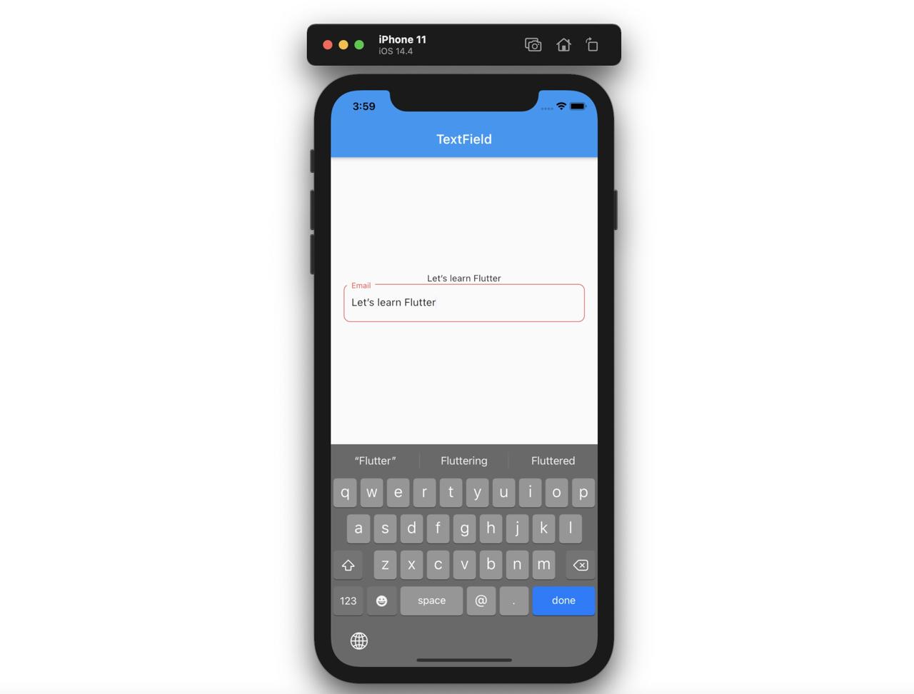
Now, if you change the value in the TextField, you can see the text is printed what you insert in TextField like below.
TextEditingController
We can update the data in real time as above, we can access the current input when the specific event is triggered. In this case, we need ot use the TextEditingController.
You can use the TextEditingController like below.
class _HomeState extends State<Home> {
  TextEditingController inputController = TextEditingController();
  String inputText = '';

  @override
  Widget build(BuildContext context) {
    return Scaffold(
      appBar: AppBar(
        title: Text('TextField'),
      ),
      body: Center(
        child: GestureDetector(
          onTap: () => FocusScope.of(context).unfocus(),
          child: SingleChildScrollView(
            child: Column(
              children: [
                Text('$inputText'),
                Padding(
                  padding: EdgeInsets.fromLTRB(20.0, 0.0, 20.0, 10.0),
                  child: TextField(
                    controller: inputController,
                    decoration: InputDecoration(
                      labelText: 'Email',
                      hintText: 'Enter your email',
                      labelStyle: TextStyle(color: Colors.redAccent),
                      focusedBorder: OutlineInputBorder(
                        borderRadius: BorderRadius.all(Radius.circular(10.0)),
                        borderSide:
                            BorderSide(width: 1, color: Colors.redAccent),
                      ),
                      enabledBorder: OutlineInputBorder(
                        borderRadius: BorderRadius.all(Radius.circular(10.0)),
                        borderSide:
                            BorderSide(width: 1, color: Colors.redAccent),
                      ),
                      border: OutlineInputBorder(
                        borderRadius: BorderRadius.all(Radius.circular(10.0)),
                      ),
                    ),
                    keyboardType: TextInputType.emailAddress,
                  ),
                ),
                ElevatedButton(
                  onPressed: () {
                    setState(() {
                      inputText = inputController.text;
                    });
                  },
                  child: Text('Update'),
                ),
              ],
            ),
          ),
        ),
      ),
    );
  }
}
Let’s see the details about how to use the TextEditingController to get the user input.
TextEditingController inputController = TextEditingController();
String inputText = '';
...
Text('$inputText'),
...
TextField(
  controller: inputController,
  ...,
),
...
ElevatedButton(
  onPressed: () {
    setState(() {
      inputText = inputController.text;
    });
  },
  child: Text('Update'),
),
...
First, we need to defined the TextEditingController, and pass it to the controller parameter of the TextField. And when the ElevatedButton button is pressed, update the variable via setState. At this time, we can access the TextField value via inputController.text.
This way is normally used to send the data to the server.
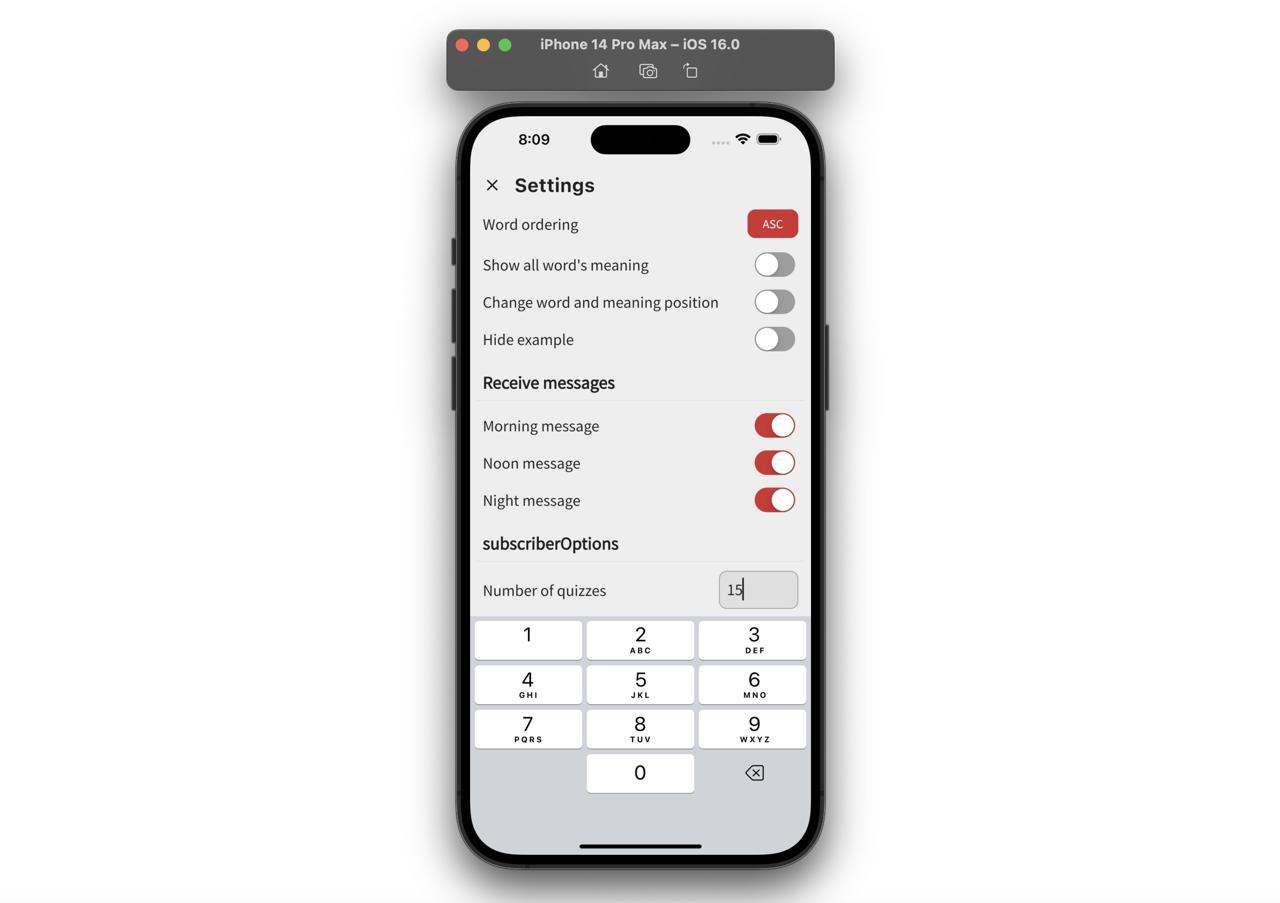
Scaffold resizeToAvoidBottomInset option
When you use the TextField widget, the space is shown up between the keyboard and contents like the following sometimes.
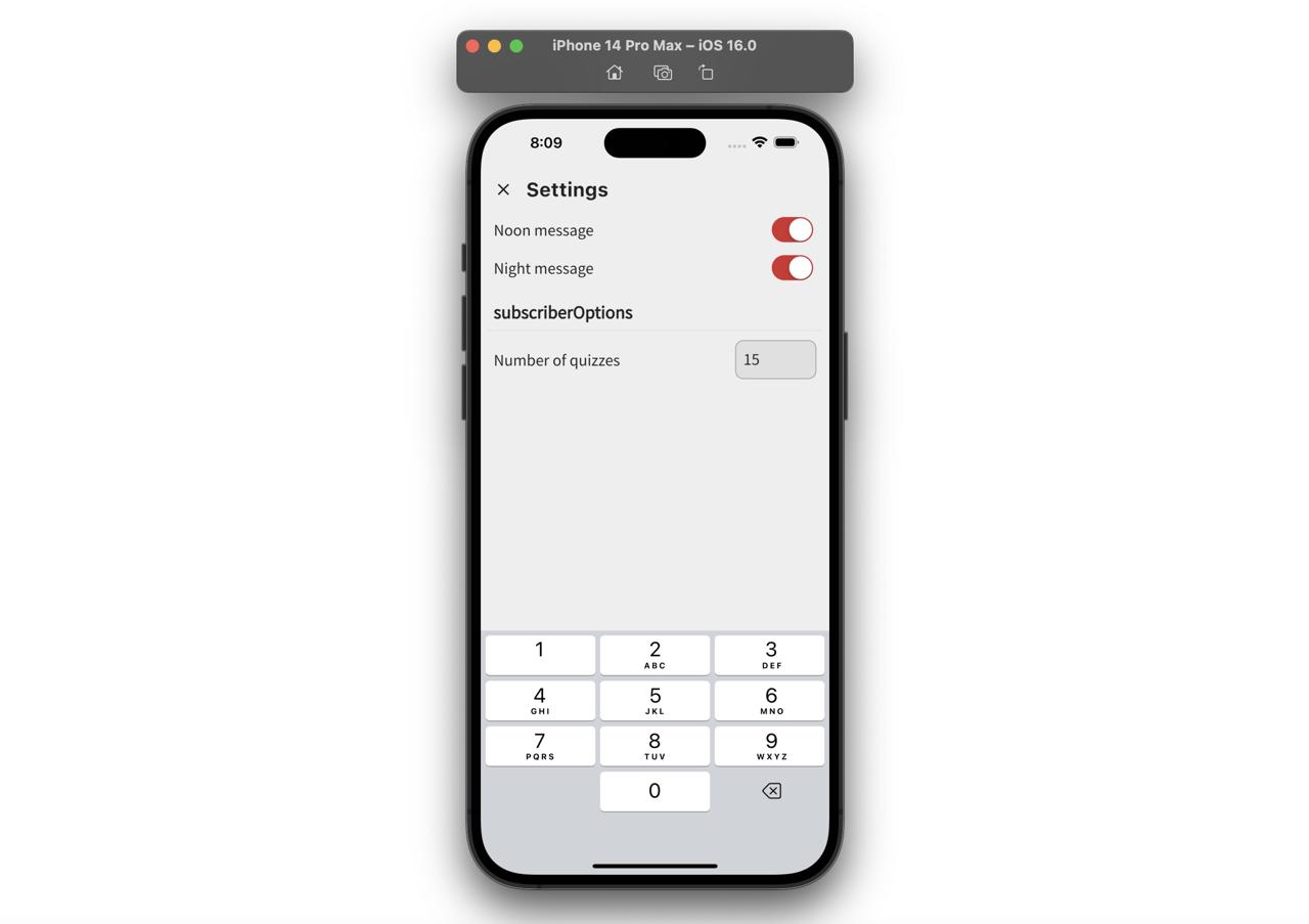
At this time, you can solve it with the resizeToAvoidBottomInset option of Scaffold.
Scaffold(
  resizeToAvoidBottomInset: false,
  appBar: ...,
  body: GestureDetector(
    onTap: () => Get.focusScope!.unfocus(),
    child: SingleChildScrollView(
      child: Column(
        children: [
          ...,
        ],
      ),
    ),
  ),
);
After setting false to the resizeToAvoidBottomInset option of Scaffold, you can see the problem is solved like the following.
Completed
Done! we’ve seen how to use the TextField widget to access and use the user input!
Was my blog helpful? Please leave a comment at the bottom. it will be a great help to me!
App promotion
Deku.Deku created the applications with Flutter.If you have interested, please try to download them for free.
