Contents
Outline
In this blog post, I will introduce the Layout widgets, and how to use them.
You can see the source code of the blog post in the link below.
SafeArea
The latest smartphone screen is designed to make the most of the app screen. The area where the app is displayed, such as the Notch design in iOS and the bottom of the status bar in Android, has been expended.
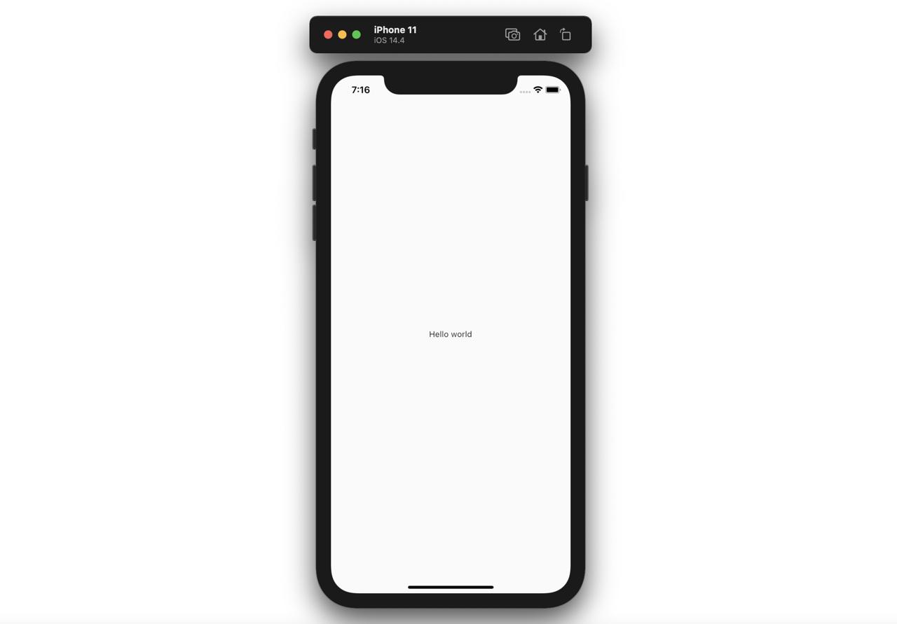
Therefore, if we use the code like below,
@override
Widget build(BuildContext context) {
  return Scaffold(
    body: Text('Hello world'),
  );
}
The widget is displayed under the status bar like below.
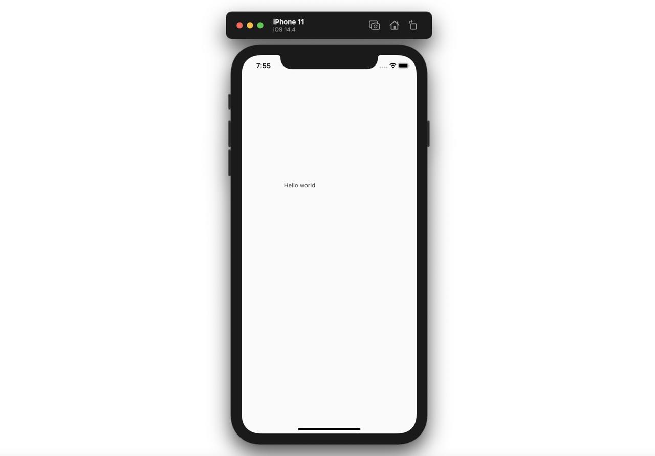
To solve this problem, we can use the SafeArea widget. We can use SafeArea lik below.
@override
Widget build(BuildContext context) {
  return Scaffold(
    body: SafeArea(
      child: Text('Hello world'),
    ),
  );
}
If we use SafeArea like this, the widget isn’t shown up under the status bar like below.

Center
The Center shows the child widget on the center.
@override
Widget build(BuildContext context) {
  return Scaffold(
    body: Center(
      child: Text('Hello world'),
    ),
  );
}
Like above, when we pass the Text widget to the child of Center widget, the widget will be shown up on the center like below.
Padding
The Padding widget will show the child widget with padding.
@override
Widget build(BuildContext context) {
  return Scaffold(
    body: Padding(
      child: Text('Hello world'),
      padding: EdgeInsets.fromLTRB(100.0, 300.0, 10.0, 40.0),
    ),
  );
}
Like above, when we set the child widget to the Padding widget and set the padding, the child widget is shown up with padding.
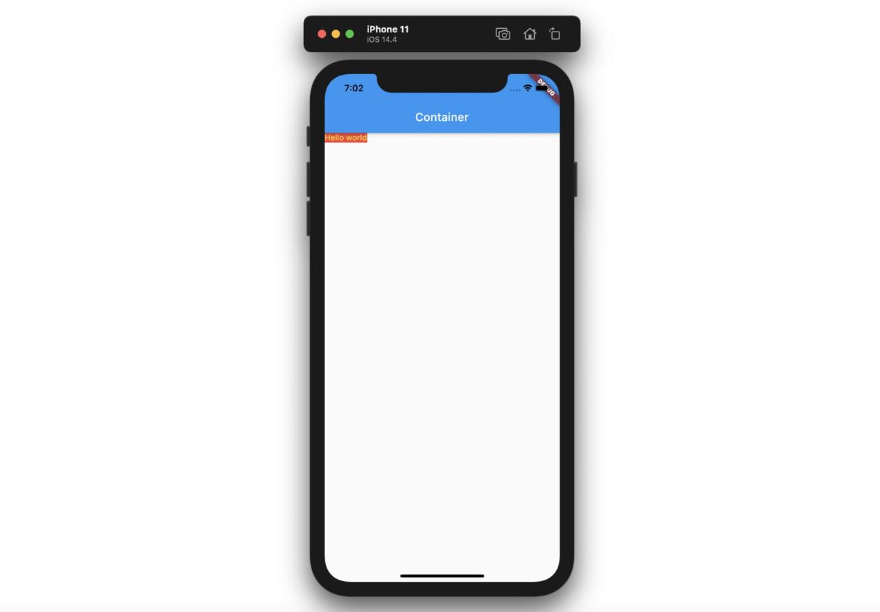
Container
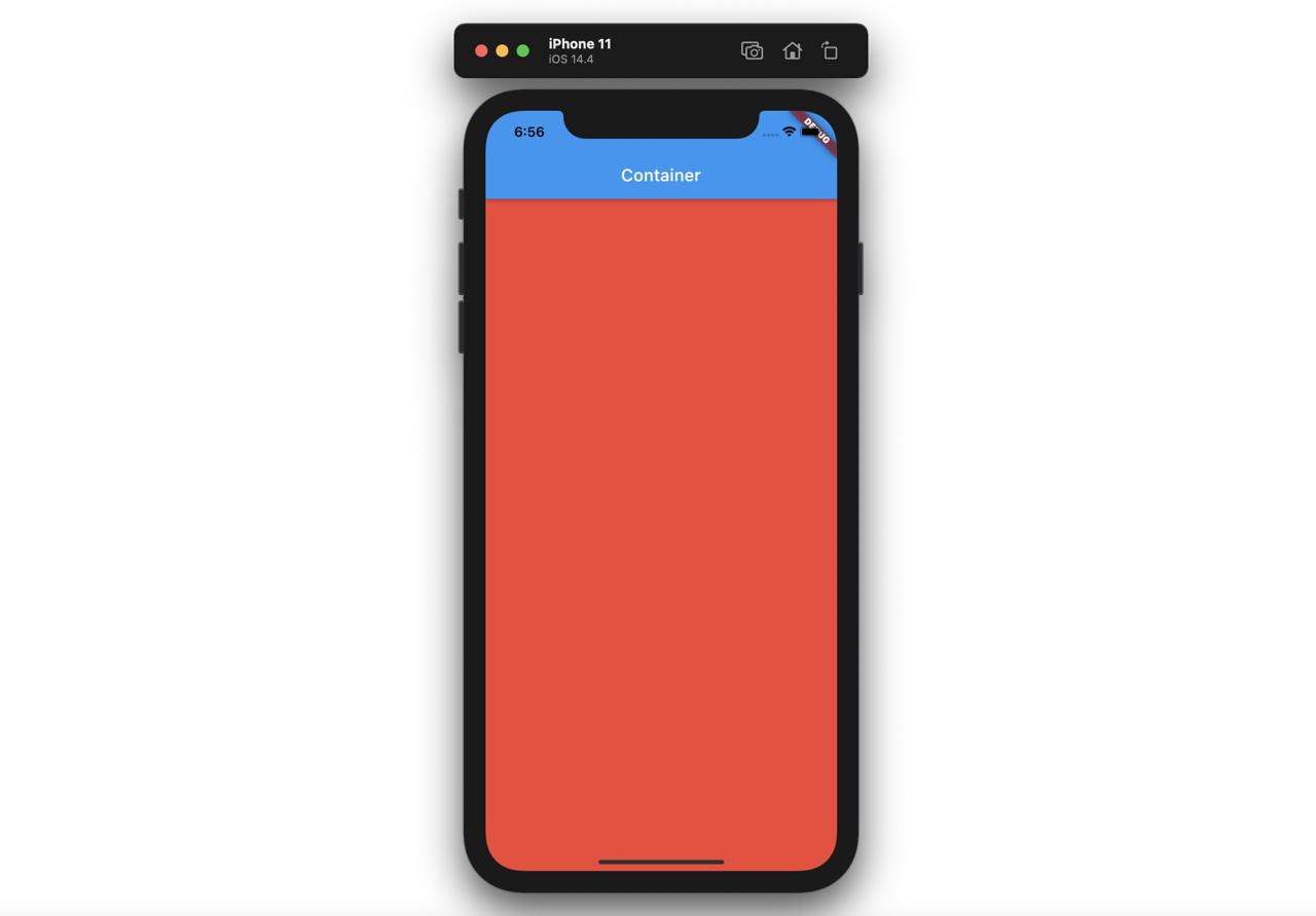
When we use the Container widget, the widget will be shown up as possible as big.
@override
Widget build(BuildContext context) {
  return Scaffold(
    appBar: AppBar(
      title: Text('Container'),
    ),
    body: Container(
      color: Colors.red,
    ),
  );
}
Like this, The Container will be shown up as possible as big(full screen) like below.
If the Container widget has the child widget, the Container widget will be shown up with the child widget size.
@override
Widget build(BuildContext context) {
  return Scaffold(
    appBar: AppBar(
      title: Text('Container'),
    ),
    body: Container(
      color: Colors.red,
      child: Text(
        'Hello world',
        style: TextStyle(color: Colors.yellow),
      ),
    ),
  );
}
Like above, if the Container has the child widget, the Container widget will be shown up the child widget size.
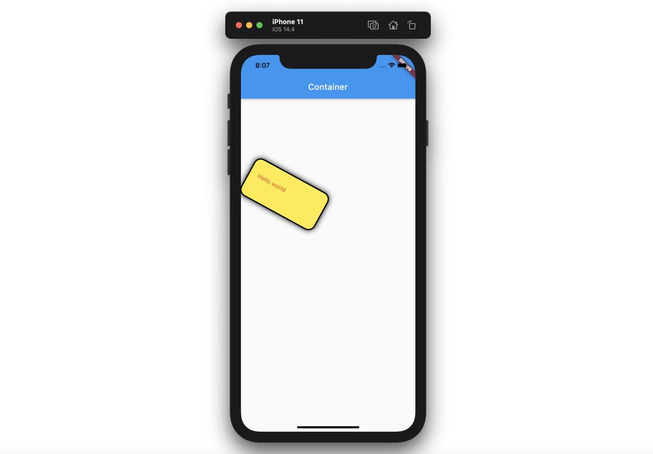
The Container widget has many parameters unlink Padding.
@override
Widget build(BuildContext context) {
  return Scaffold(
    appBar: AppBar(
      title: Text('Container'),
    ),
    body: Container(
      child: Text(
        'Hello world',
        style: TextStyle(color: Colors.red),
      ),
      padding: EdgeInsets.fromLTRB(20.0, 30.0, 40.0, 50.0),
      margin: EdgeInsets.all(100.0),
      width: 200,
      height: 100,
      transform: Matrix4.rotationZ(0.5),
      decoration: BoxDecoration(
        color: Colors.yellow,
        border: Border.all(color: Colors.black, width: 3),
        borderRadius: BorderRadius.all(Radius.circular(18)),
        boxShadow: const [
          BoxShadow(blurRadius: 10),
        ],
      ),
    ),
  );
}
Like this, when we use the Container widget with the parameters, the Container widget is shown up like below.
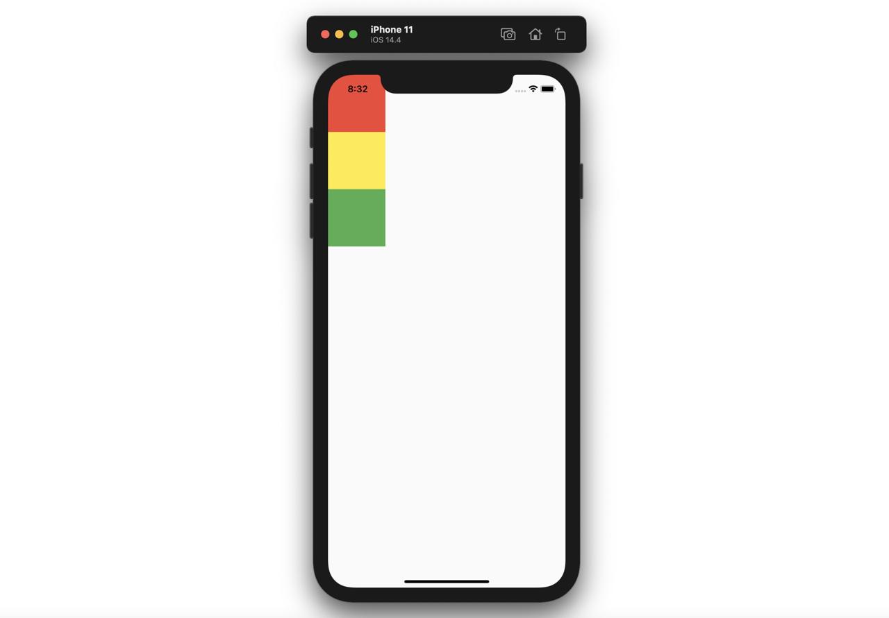
Column and Row
Let’s see how to use the Column widget and Row widget which are used most frequently in Flutter.
Column
The Column widget shows the children widget vertically. The Column will occupy all areas of the vertical.
@override
Widget build(BuildContext context) {
  return Scaffold(
    body: Column(
      children: [
        Container(
          width: 100,
          height: 100,
          color: Colors.red,
        ),
        Container(
          width: 100,
          height: 100,
          color: Colors.yellow,
        ),
        Container(
          width: 100,
          height: 100,
          color: Colors.green,
        ),
      ],
    ),
  );
}
As above, the Column widget displays vertically the widgets, which are passed by the children parameter, like below.
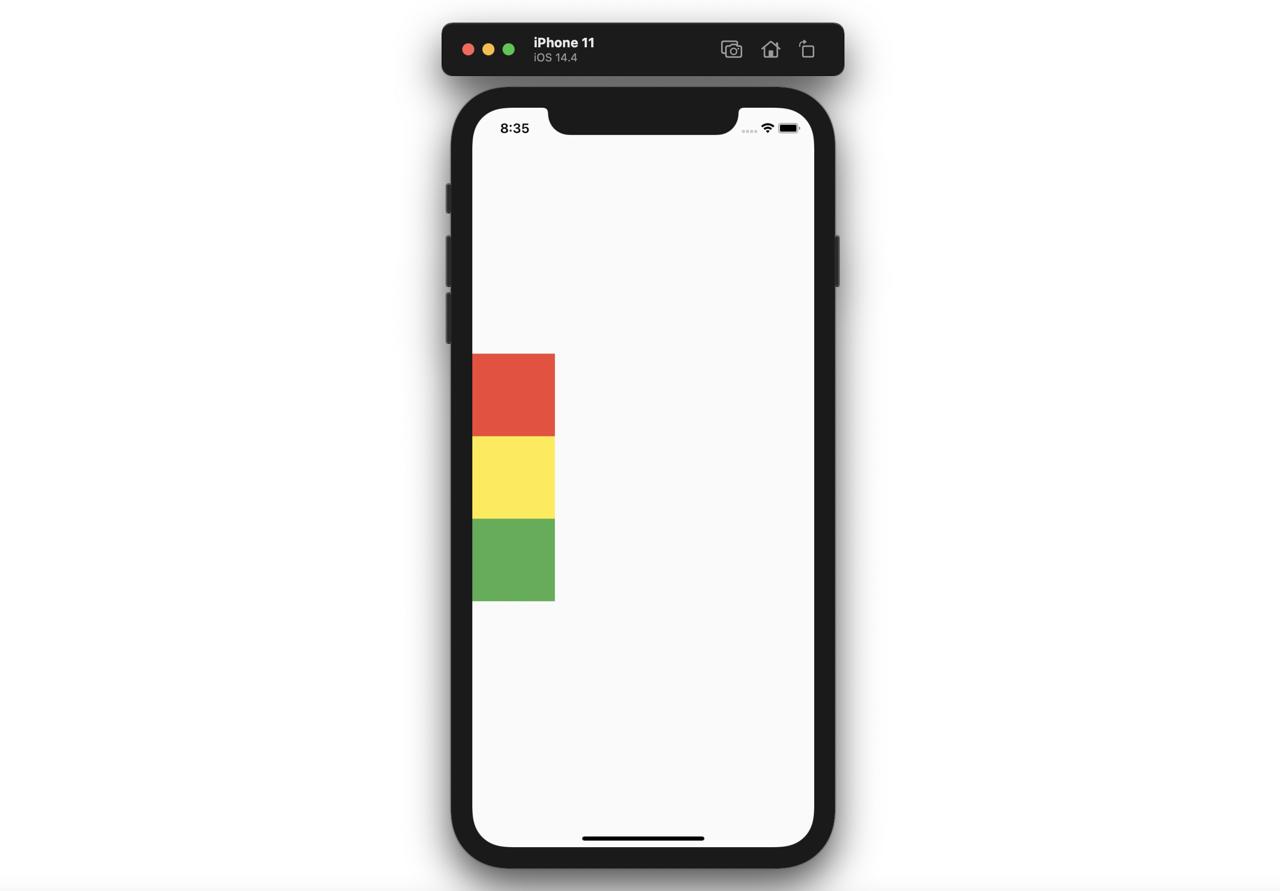
When we use the mainAxisAlignment parameter of the Column, we can change the alignment of the children.
- center
@override
Widget build(BuildContext context) {
  return Scaffold(
    body: Column(
      mainAxisAlignment: MainAxisAlignment.center,
      children: [
        Container(
          width: 100,
          height: 100,
          color: Colors.red,
        ),
        Container(
          width: 100,
          height: 100,
          color: Colors.yellow,
        ),
        Container(
          width: 100,
          height: 100,
          color: Colors.green,
        ),
      ],
    ),
  );
}
- end
@override
Widget build(BuildContext context) {
  return Scaffold(
    body: Column(
      mainAxisAlignment: MainAxisAlignment.end,
      children: [
        Container(
          width: 100,
          height: 100,
          color: Colors.red,
        ),
        Container(
          width: 100,
          height: 100,
          color: Colors.yellow,
        ),
        Container(
          width: 100,
          height: 100,
          color: Colors.green,
        ),
      ],
    ),
  );
}
- spaceAround
@override
Widget build(BuildContext context) {
  return Scaffold(
    body: Column(
      mainAxisAlignment: MainAxisAlignment.spaceAround,
      children: [
        Container(
          width: 100,
          height: 100,
          color: Colors.red,
        ),
        Container(
          width: 100,
          height: 100,
          color: Colors.yellow,
        ),
        Container(
          width: 100,
          height: 100,
          color: Colors.green,
        ),
      ],
    ),
  );
}
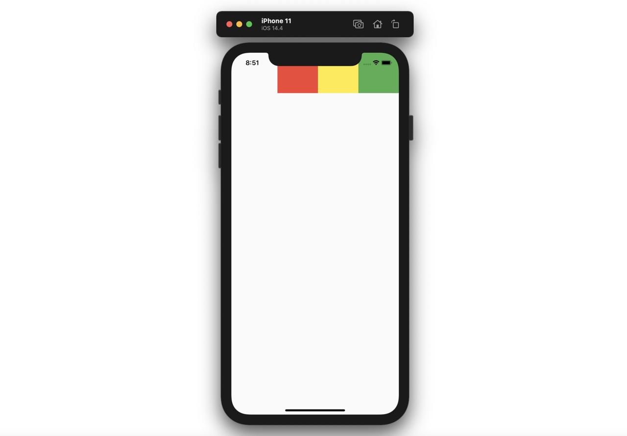
Row
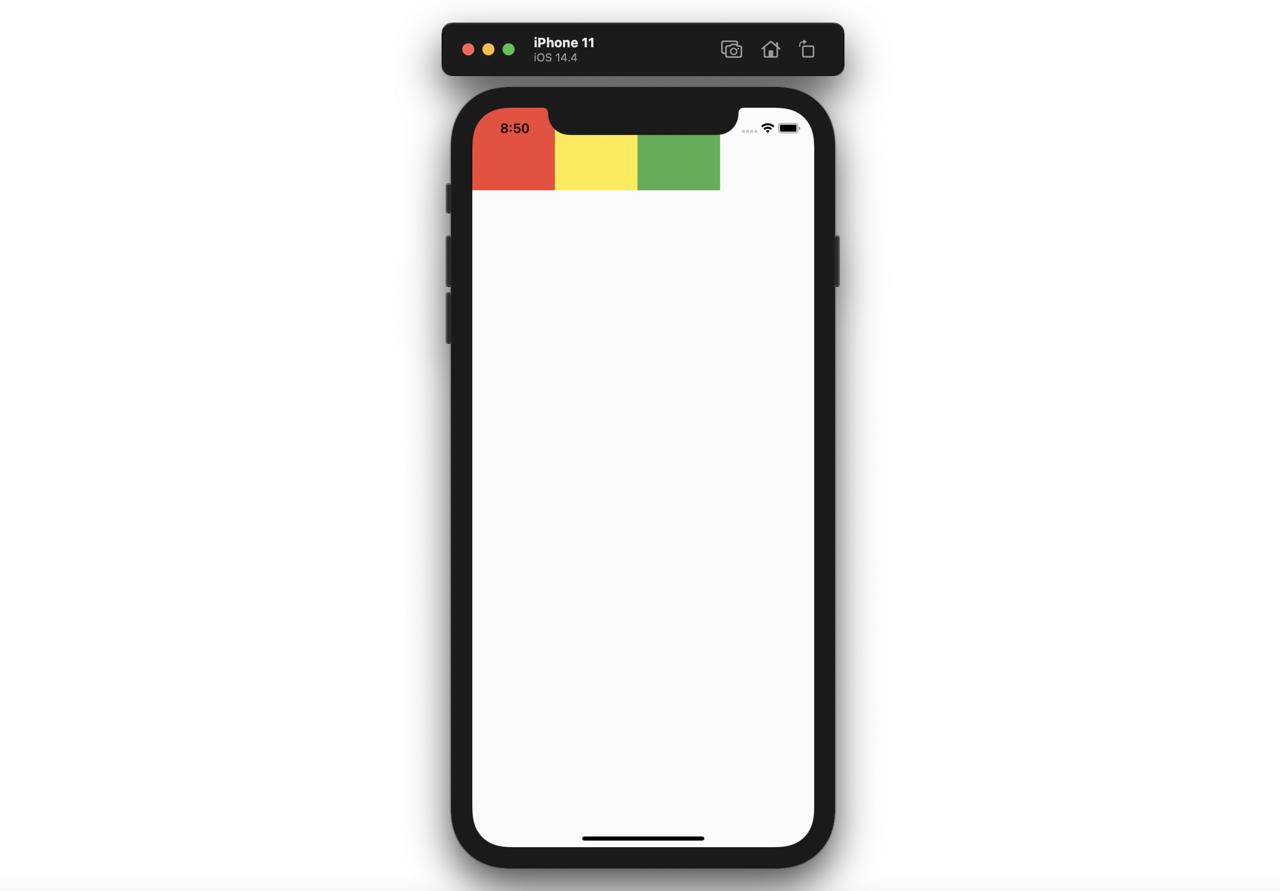
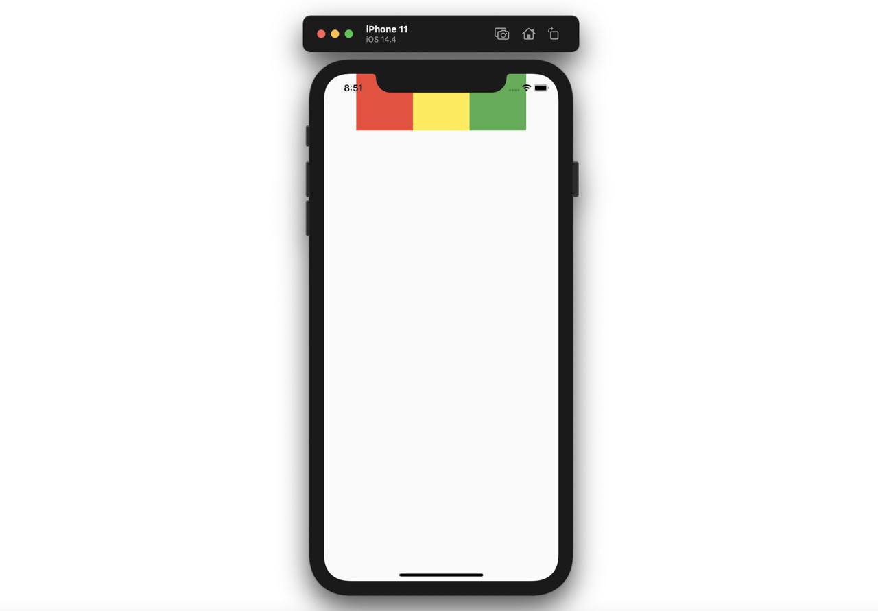
The Row shows the children widgets horizontally. The Row widget will occupy the full areas of horizontal.
@override
Widget build(BuildContext context) {
  return Scaffold(
    body: Row(
      children: [
        Container(
          width: 100,
          height: 100,
          color: Colors.red,
        ),
        Container(
          width: 100,
          height: 100,
          color: Colors.yellow,
        ),
        Container(
          width: 100,
          height: 100,
          color: Colors.green,
        ),
      ],
    ),
  );
}
As above, the Row widget displays the children widgets horizontally like below.
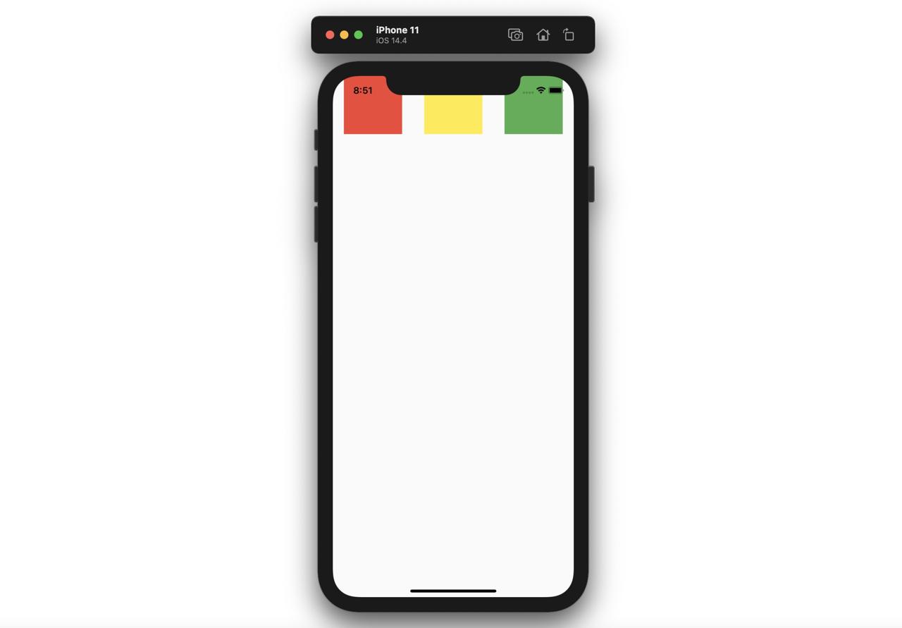
when we use the mainAxisAlignment parameter of the Row widget, we can change the alignment of the children.
- center
@override
Widget build(BuildContext context) {
  return Scaffold(
    body: Row(
      mainAxisAlignment: MainAxisAlignment.center,
      children: [
        Container(
          width: 100,
          height: 100,
          color: Colors.red,
        ),
        Container(
          width: 100,
          height: 100,
          color: Colors.yellow,
        ),
        Container(
          width: 100,
          height: 100,
          color: Colors.green,
        ),
      ],
    ),
  );
}
- end
@override
Widget build(BuildContext context) {
  return Scaffold(
    body: Row(
      mainAxisAlignment: MainAxisAlignment.end,
      children: [
        Container(
          width: 100,
          height: 100,
          color: Colors.red,
        ),
        Container(
          width: 100,
          height: 100,
          color: Colors.yellow,
        ),
        Container(
          width: 100,
          height: 100,
          color: Colors.green,
        ),
      ],
    ),
  );
}
- spaceAround
@override
Widget build(BuildContext context) {
  return Scaffold(
    body: Row(
      mainAxisAlignment: MainAxisAlignment.spaceAround,
      children: [
        Container(
          width: 100,
          height: 100,
          color: Colors.red,
        ),
        Container(
          width: 100,
          height: 100,
          color: Colors.yellow,
        ),
        Container(
          width: 100,
          height: 100,
          color: Colors.green,
        ),
      ],
    ),
  );
}
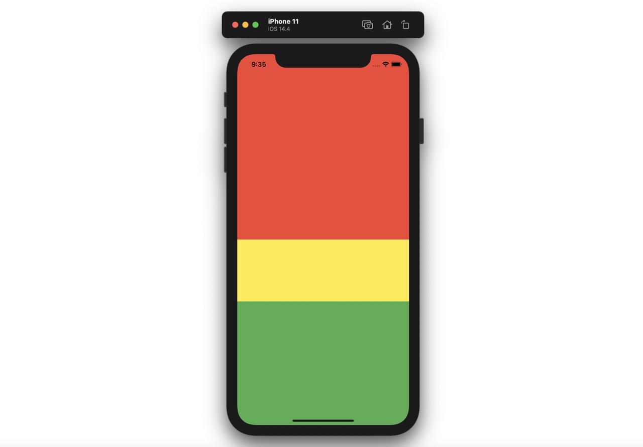
Expanded
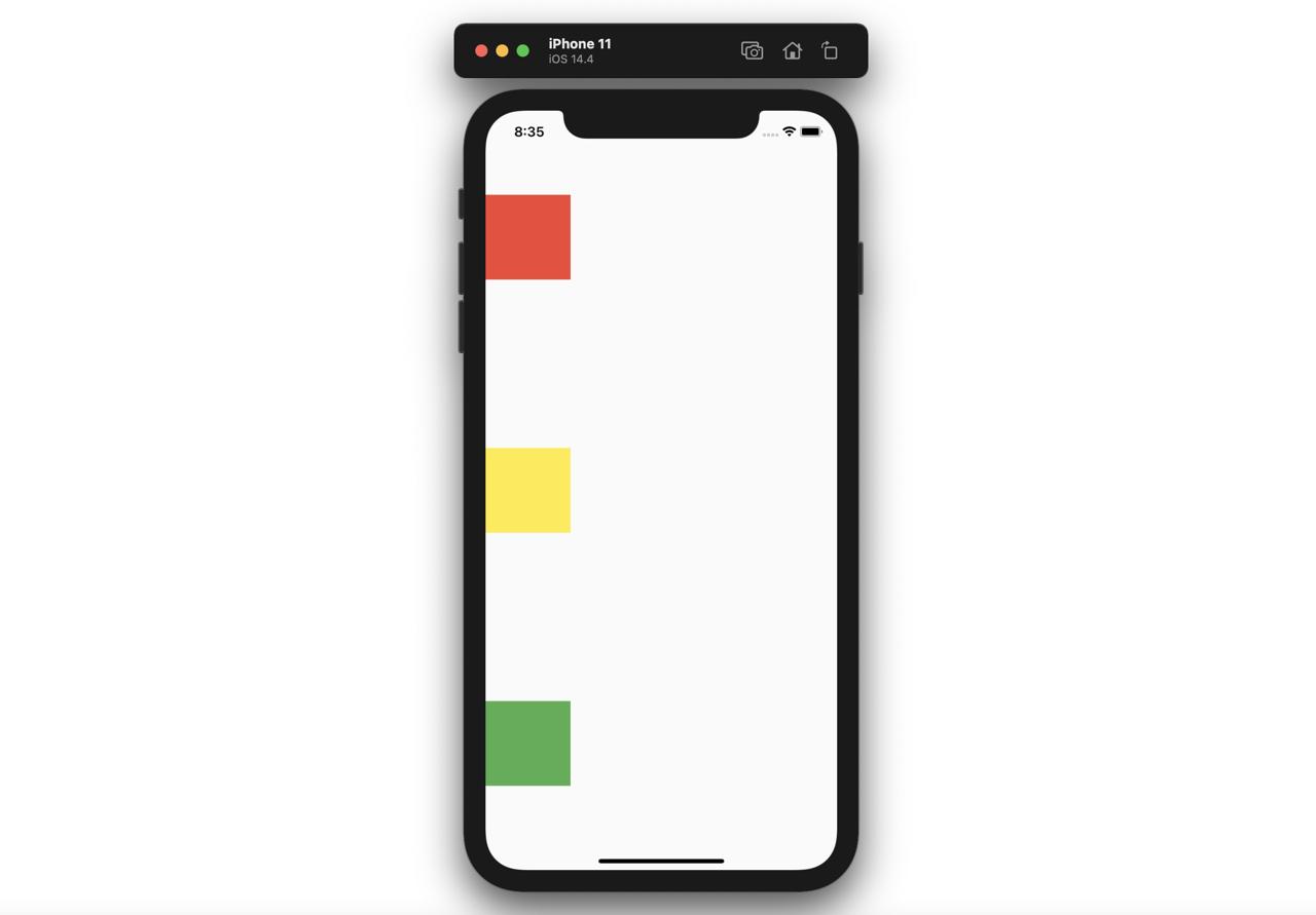
The Expanded widget is used with the Column widget or Row widget, and we can implement the flex feature like the web.
@override
Widget build(BuildContext context) {
  return Scaffold(
    body: Column(
      children: [
        Expanded(
          child: Container(
            color: Colors.red,
          ),
          flex: 3,
        ),
        Expanded(
          child: Container(
            color: Colors.yellow,
          ),
          flex: 1,
        ),
        Expanded(
          child: Container(
            color: Colors.green,
          ),
          flex: 2,
        ),
      ],
    ),
  );
}
Like above, when the Expanded widget is used for the children of the Column widget, and the flex parameter of the Expanded widget is set, we can make the flex feature like the web.
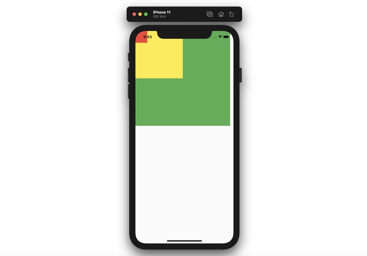
Stack
If we use the Stack widget, we can show the widget above the other widgets.
@override
Widget build(BuildContext context) {
  return Scaffold(
    body: Stack(
      children: [
        Container(
          width: 400,
          height: 400,
          color: Colors.green,
        ),
        Container(
          width: 200,
          height: 200,
          color: Colors.yellow,
        ),
        Container(
          width: 50,
          height: 50,
          color: Colors.red,
        ),
      ],
    ),
  );
}
when we use the Stack widget like above, we can see the widget is displayed above the another widget like below.
SizedBox
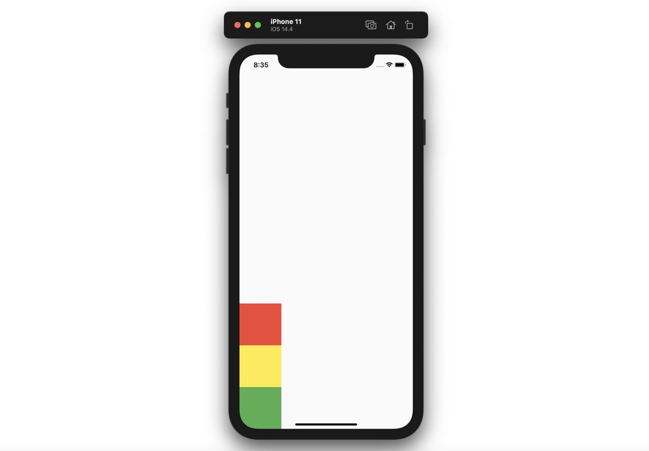
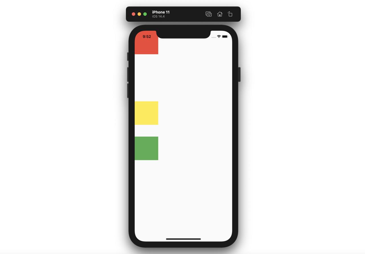
The SizedBox is often used for making the space between widgets.
@override
Widget build(BuildContext context) {
  return Scaffold(
    body: Column(
      children: [
        Container(
          color: Colors.red,
          width: 100,
          height: 100,
        ),
        SizedBox(
          height: 200,
        ),
        Container(
          color: Colors.yellow,
          width: 100,
          height: 100,
        ),
        SizedBox(
          height: 50,
        ),
        Container(
          color: Colors.green,
          width: 100,
          height: 100,
        ),
      ],
    ),
  );
}
If you add the SizedBox widget between the widgets, you can see the empty space is added well like below.
Completed
I introduced the Layout widgets and how to use them. Now, you can make the various layouts of the app!
Was my blog helpful? Please leave a comment at the bottom. it will be a great help to me!
App promotion
Deku.Deku created the applications with Flutter.If you have interested, please try to download them for free.