Contents
Outline
In this blog post, I will introduce how to use GetX to manage the theme in Flutter. You can see full source code of this blog post on the link below.
Blog series
This blog post is made in the series about how to use GetX in Flutter. If you want to see the other features of the GetX, please check out the following blog posts.
- [GetX] State management
- [GetX] Route management
- [GetX] Dependency management
- [GetX] Localization
- [GetX] Theme
- [GetX] BottomSheet
- [GetX] Dialog
- [GetX] Snackbar
- [GetX] Platform and device info
GetX installation
To check how to use GetX for the theme in Flutter, execute the command below to create a new Flutter project.
flutter create themeAnd then, execute the command below to install the GetX package.
flutter pub add getNext, let’s see how to use Theme with GetX.
Configure Theme
To apply the theme by GetX, we need to configure theme and darkTheme of GetMaterialApp. Open the lib/main.dart file and modify it like the below.
import 'package:get/get.dart';

class MyApp extends StatelessWidget {
  const MyApp({Key? key}) : super(key: key);

  @override
  Widget build(BuildContext context) {
    return GetMaterialApp(
      title: 'Flutter Demo',
      theme: ThemeData(primarySwatch: Colors.blue),
      darkTheme: ThemeData.dark().copyWith(primaryColor: Colors.red),
      home: const MyHomePage(),
    );
  }
}
In here, the theme is for the light mode and the darkTheme is for the dark mode. Configure them as you like.
Change Theme
If you configure the theme like above, you can change the theme by GetX. To change the theme, you can use the Get.changeTheme method.
Get.changeTheme(ThemeData.dark());Check current theme
You can check the current theme is the light or dark by Get.isDarkMode of GetX. You can use it when you change the theme like the below.
Get.changeTheme(
  Get.isDarkMode ? ThemeData.light() : ThemeData.dark(),
);
Get device theme
Normally, when the app is started for the first time, the app theme is configured depending on the device theme. In Flutter, you can get the device theme like the below.
import 'package:flutter/scheduler.dart';
...
final isLight = SchedulerBinding.instance?.window.platformBrightness == Brightness.light;
You can use it to configure the app theme depending on the device theme when the app is started for the first time.
Example
To check GetX theme usage, open the lib/main.dart file and modify it like the below.
class MyHomePage extends StatelessWidget {
  const MyHomePage({Key? key}) : super(key: key);

  @override
  Widget build(BuildContext context) {
    return Scaffold(
      appBar: AppBar(
        systemOverlayStyle: Get.isDarkMode
            ? SystemUiOverlayStyle.light
            : SystemUiOverlayStyle.dark,
        title: Text(
          Get.isDarkMode ? 'Dark Theme' : 'Light Theme',
          style: Theme.of(context).textTheme.headline4,
        ),
      ),
      body: Center(
        child: OutlinedButton(
          onPressed: () {
            Get.changeTheme(
              Get.isDarkMode ? ThemeData.light() : ThemeData.dark(),
            );
          },
          child: const Text('Change Theme'),
        ),
      ),
    );
  }
}
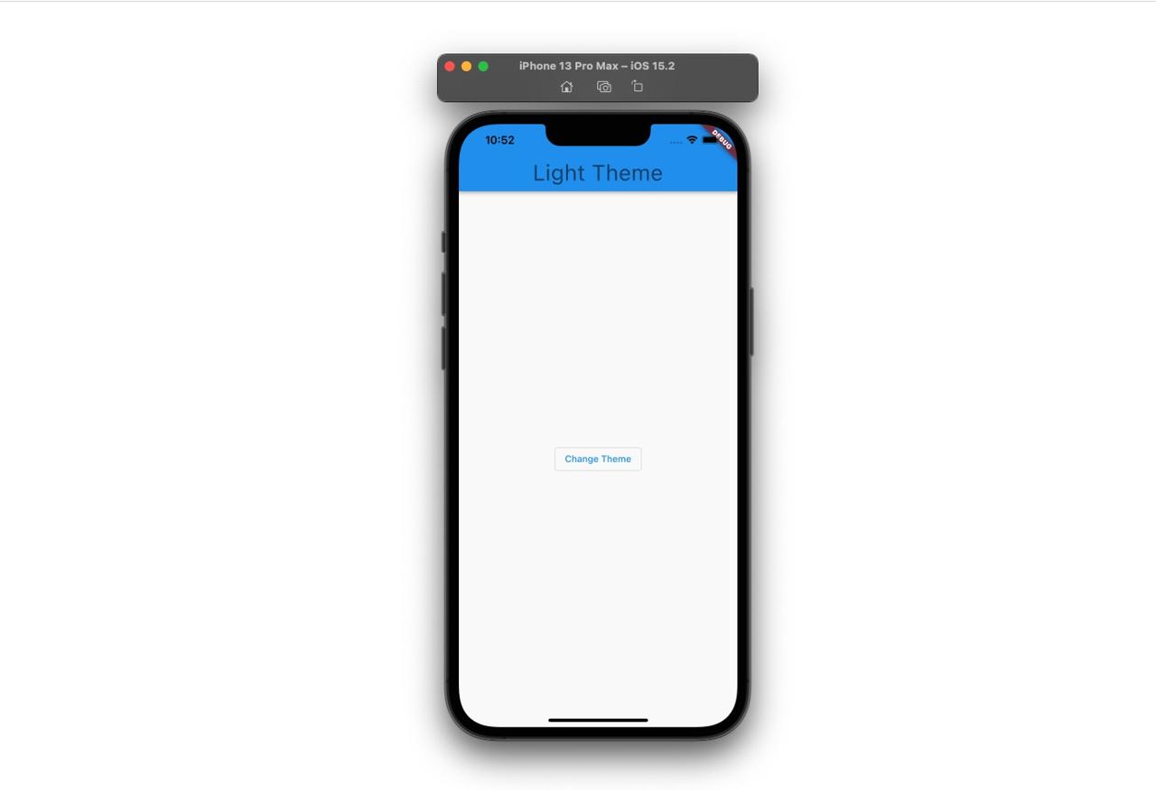
When you execute the code, you can see the app with the Light mode.

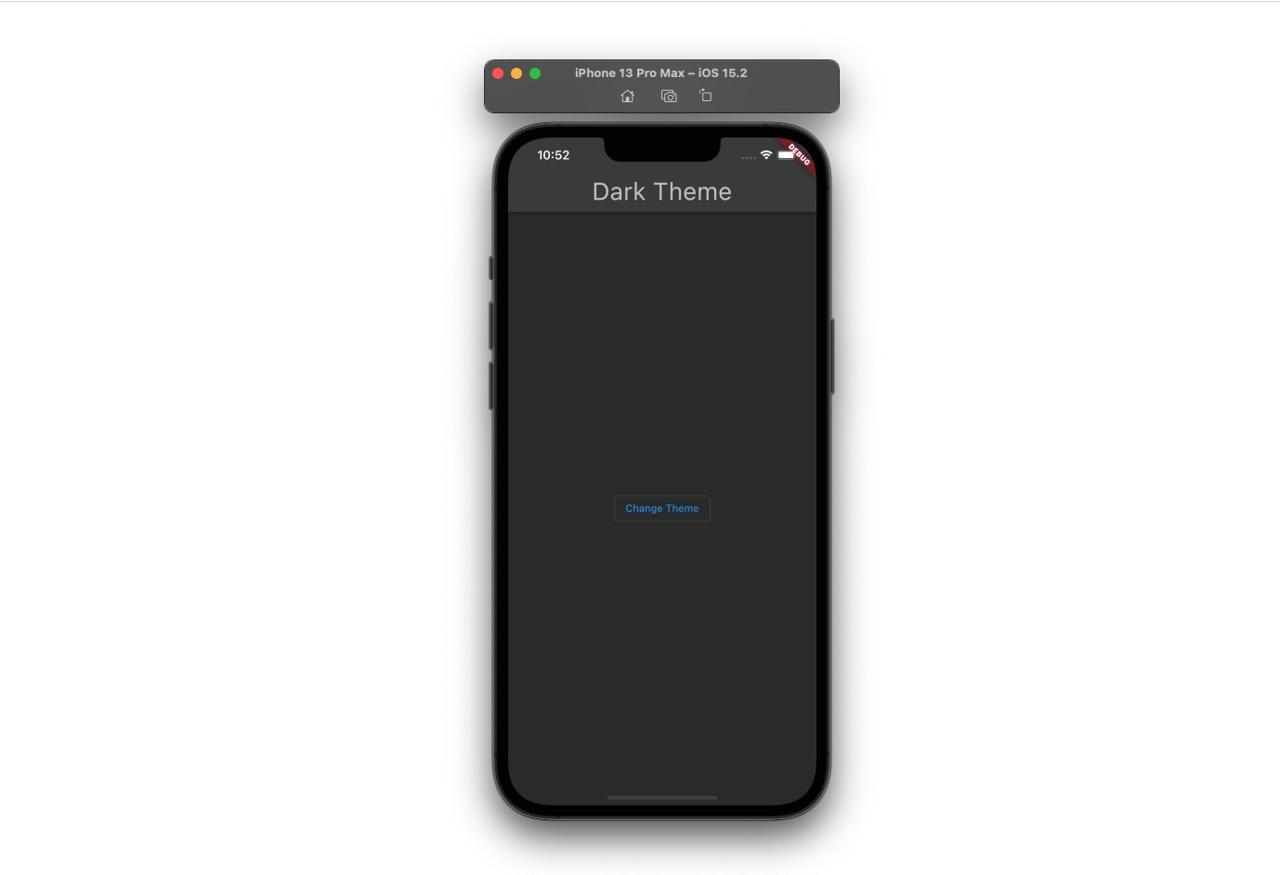
When you press the button on the screen, you can see the app theme is changed to the Dark mode.

Configurable theme
The next is the configurable theme that I found when I develop the app. Normally, we can’t configure all themes, so we’ll copy and use the basic theme that Flutter provides like the below.
final themeData = Get.isDarkMode ? ThemeData.dark() : ThemeData.light();
...
themeData.copyWith(
  ...
);
AppBar theme
You can change the text and icon color of the AppBar like the below.
themeData.copyWith(
  ...
  appBarTheme: AppBarTheme(
    color: white,
    titleTextStyle: TextStyle(color: black),
    iconTheme: IconThemeData(color: black),
  ),
  ...
);
Scaffold background color
You can configure the background color of the Scaffold like the below.
themeData.copyWith(
  ...
  scaffoldBackgroundColor: white,
  ...
);
Primary and Secondary color
You can change the Primary and Secondary colors like the below.
themeData.copyWith(
  ...
  primaryColor: black,
  colorScheme: themeData.colorScheme.copyWith(
    primary: black,
    secondary: black,
  ),
  ...
);
Text theme
You can change the text theme in Flutter like the below.
final textStyle = TextStyle(color: black);
final textTheme = TextTheme(
  headline1: textStyle,
  headline2: textStyle,
  headline3: textStyle,
  headline4: textStyle,
  headline5: textStyle,
  headline6: textStyle,
  subtitle1: textStyle,
  subtitle2: textStyle,
  bodyText1: textStyle,
  bodyText2: textStyle,
  caption: textStyle,
  button: textStyle,
  overline: textStyle,
);

themeData.copyWith(
  ...
  textTheme: textTheme,
  primaryTextTheme: textTheme,
  ...
);
Divider color
You can change the Divider color like the below.
themeData.copyWith(
  ...
  dividerColor: lightGray,
  ...
);
Icon theme
You can change the icon theme like the below.
themeData.copyWith(
  ...
  iconTheme: iconTheme,
  primaryIconTheme: iconTheme,
  ...
);
TextButton theme
You can change the TextButton theme like the below.
themeData.copyWith(
  ...
  textButtonTheme: TextButtonThemeData(
    style: TextButton.styleFrom(primary: black),
  ),
  ...
);
OutlinedButton theme
You can change the OutlinedButton theme like the below.
themeData.copyWith(
  ...
  outlinedButtonTheme: OutlinedButtonThemeData(
    style: TextButton.styleFrom(
      primary: black,
      side: BorderSide(color: black, width: 1),
    ),
  ),
  ...
);
TextField selection theme
You can change the selection theme in TextField like the below.
themeData.copyWith(
  ...
  textSelectionTheme: TextSelectionThemeData(
    cursorColor: Constants.black,
    selectionColor: Colors.blue.shade200,
  ),
  ...
);
Completed
Done! we’ve seen how to configure and change the theme with GetX. Also, I’ve shared how to change the widget theme that I’ve changed. Now, try to change the theme with GetX! And, If you know how to change the theme that I don’t know, please share them on the comments!
Was my blog helpful? Please leave a comment at the bottom. it will be a great help to me!
App promotion
Deku.Deku created the applications with Flutter.If you have interested, please try to download them for free.


