개요
이번 블로그 포스트에서는 Flutter에서 화면의 레이아웃을 담당하는 위젯들을 자세히 살펴보도록 하겠습니다.
이 블로그 포스트에서 소개하는 소스 코드는 아래에 링크에서 확인할 수 있습니다.
SafeArea
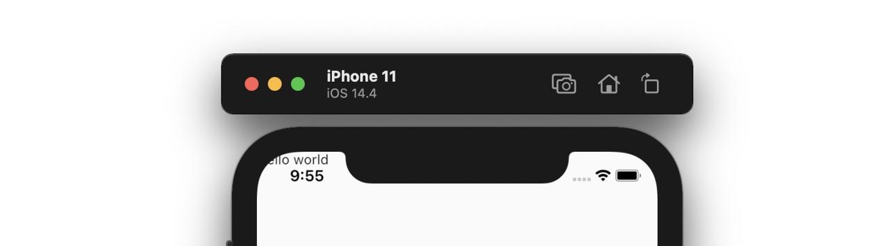
최신 스마트폰은 앱 화면을 최대한 활용할 수 있도록 디자인되었습니다. iOS의 노치(Notch) 디자인이나 안드로이드의 상태바 하단 등 앱이 표시되는 영역이 확대되었습니다.
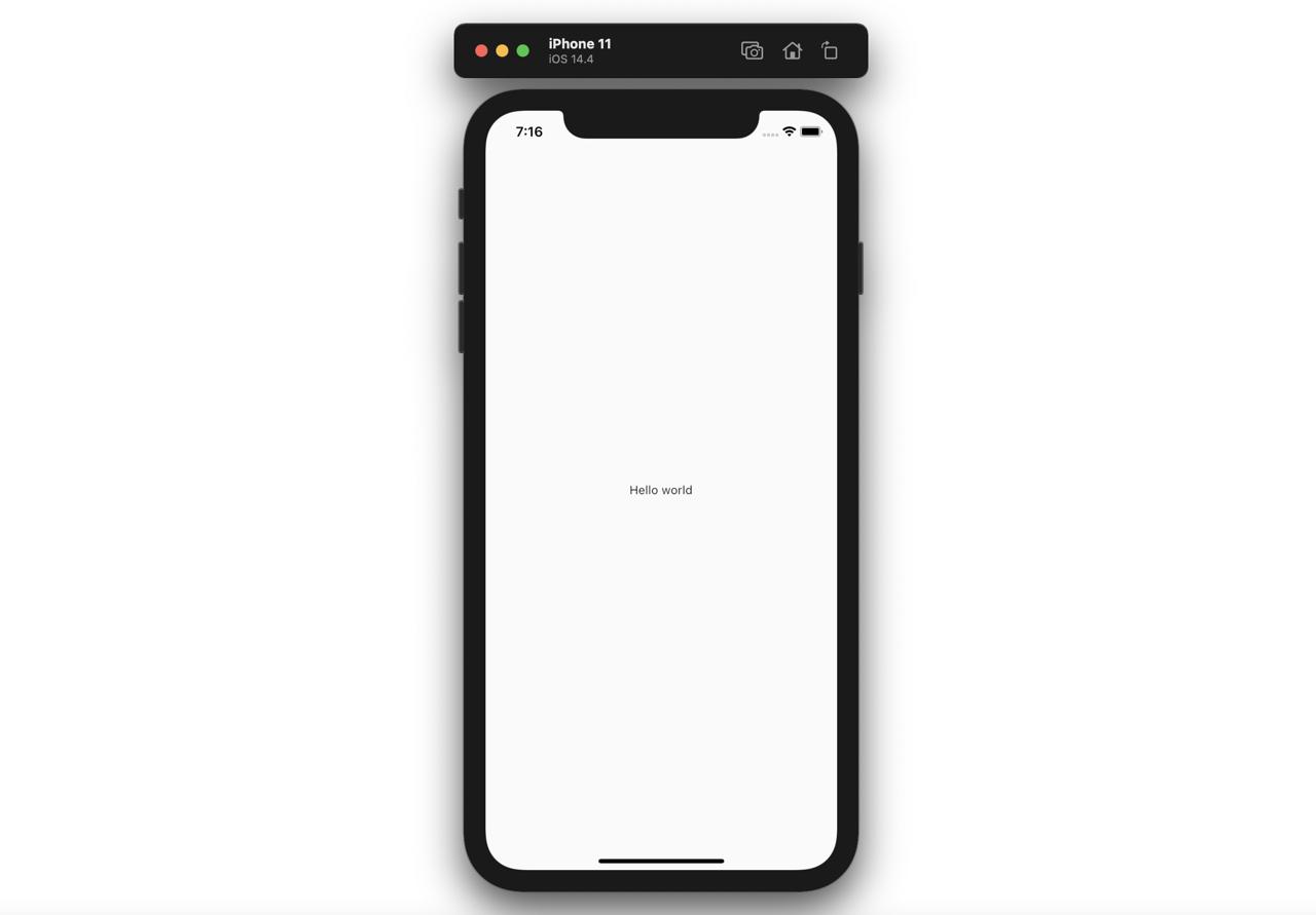
그로 인해서, 다음과 같이 코드를 작성하면,
@override
Widget build(BuildContext context) {
return Scaffold(
body: Text('Hello world'),
);
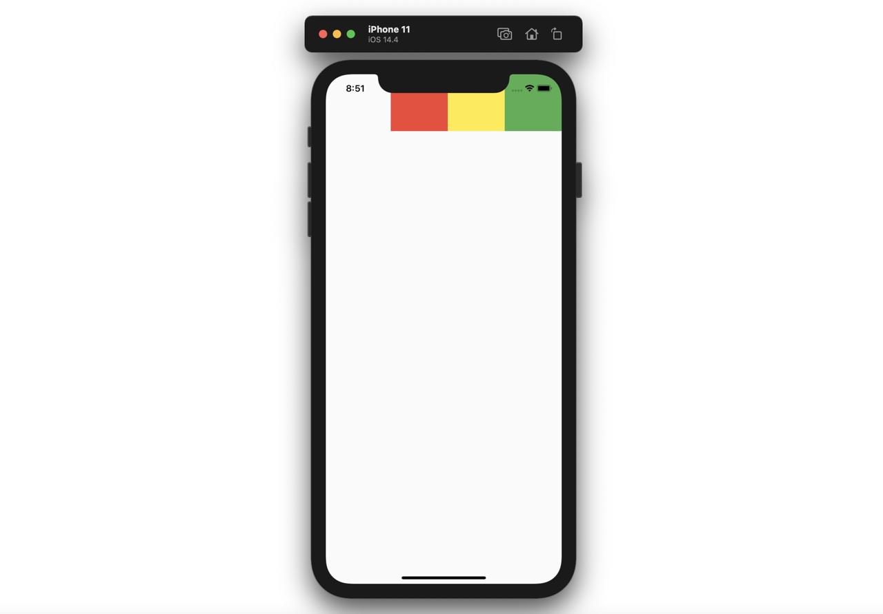
}다음과 같이 상태바 하단에 표시가 되는 문제들이 발생합니다.
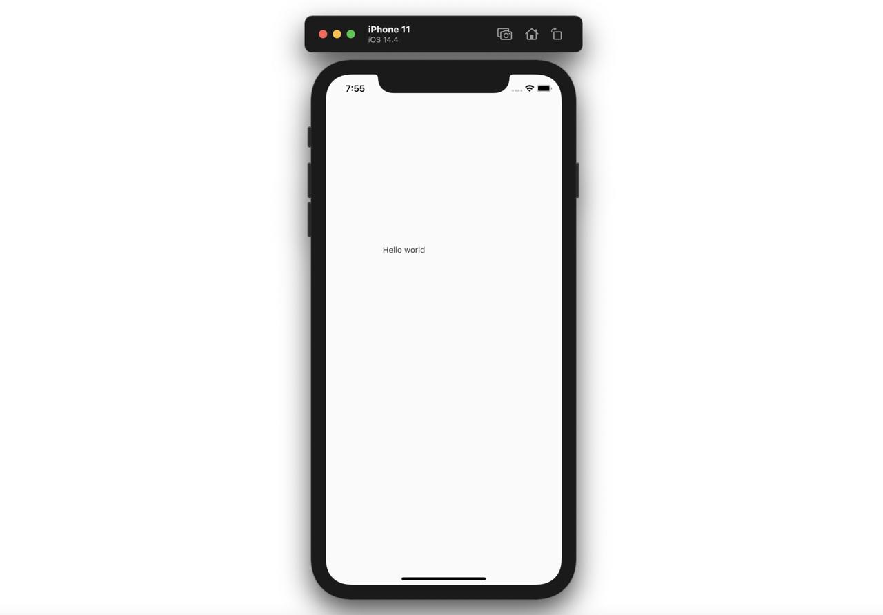
이런 문제를 해결하기 위해, 사용할 수 있는 위젯이 SafeArea입니다. SafeArea는 다음과 같이 사용할 수 있습니다.
@override
Widget build(BuildContext context) {
  return Scaffold(
    body: SafeArea(
      child: Text('Hello world'),
    ),
  );
}
이렇게 SafeArea를 사용하면 다음과 같이 상태바와 중복되지 않게 위젯들을 표시할 수 있습니다.

Center
Center 위젯은 자식 위젯을 중앙에 표시합니다.
@override
Widget build(BuildContext context) {
  return Scaffold(
    body: Center(
      child: Text('Hello world'),
    ),
  );
}
이렇게 Center 위젯의 자식 위젯으로 Text을 전달하면, 다음과 같이 중앙에 표시되는 것을 확인할 수 있습니다.
Padding
Padding 위젯는 자식 위젯 주위에 padding을 표시합니다.
@override
Widget build(BuildContext context) {
  return Scaffold(
    body: Padding(
      child: Text('Hello world'),
      padding: EdgeInsets.fromLTRB(100.0, 300.0, 10.0, 40.0),
    ),
  );
}
이렇게 Padding 위젯에 자식 위젯을 지정하고, 원하는 padding 값을 설정하면 다음과 같이 자식 위젯가 Padding과 함께 표시됩니다.
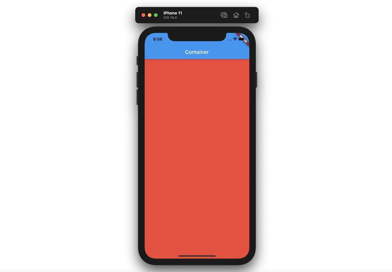
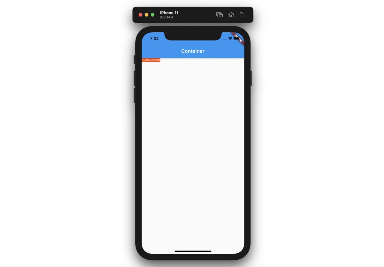
Container
Container 위젯을 사용하면, 기본적으로 최대한의 공간을 차지하여 표시됩니다.
@override
Widget build(BuildContext context) {
  return Scaffold(
    appBar: AppBar(
      title: Text('Container'),
    ),
    body: Container(
      color: Colors.red,
    ),
  );
}
이렇게 Container를 사용하면 다음과 같이 최대한의 공간(화면 전체)에 표시됩니다.
만약, Container에 자식 위젯이 제공되면, Container는 자식 위젯의 사이즈로 표시됩니다.
@override
Widget build(BuildContext context) {
  return Scaffold(
    appBar: AppBar(
      title: Text('Container'),
    ),
    body: Container(
      color: Colors.red,
      child: Text(
        'Hello world',
        style: TextStyle(color: Colors.yellow),
      ),
    ),
  );
}
이렇게 Container에 자식 위젯을 지정하면 다음과 같이 Container는 자식 위젯의 사이즈로 표시됩니다.
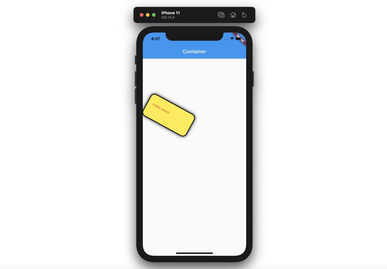
Container는 Padding과는 다르게 다음과 같이 여러 파라메터들을 사용할 수 있습니다.
@override
Widget build(BuildContext context) {
  return Scaffold(
    appBar: AppBar(
      title: Text('Container'),
    ),
    body: Container(
      child: Text(
        'Hello world',
        style: TextStyle(color: Colors.red),
      ),
      padding: EdgeInsets.fromLTRB(20.0, 30.0, 40.0, 50.0),
      margin: EdgeInsets.all(100.0),
      width: 200,
      height: 100,
      transform: Matrix4.rotationZ(0.5),
      decoration: BoxDecoration(
        color: Colors.yellow,
        border: Border.all(color: Colors.black, width: 3),
        borderRadius: BorderRadius.all(Radius.circular(18)),
        boxShadow: const [
          BoxShadow(blurRadius: 10),
        ],
      ),
    ),
  );
}
이렇게 여러 파라메터들을 사용하면 다음과 같이 파라메터가 적용된 Container 위젯이 표시됩니다.
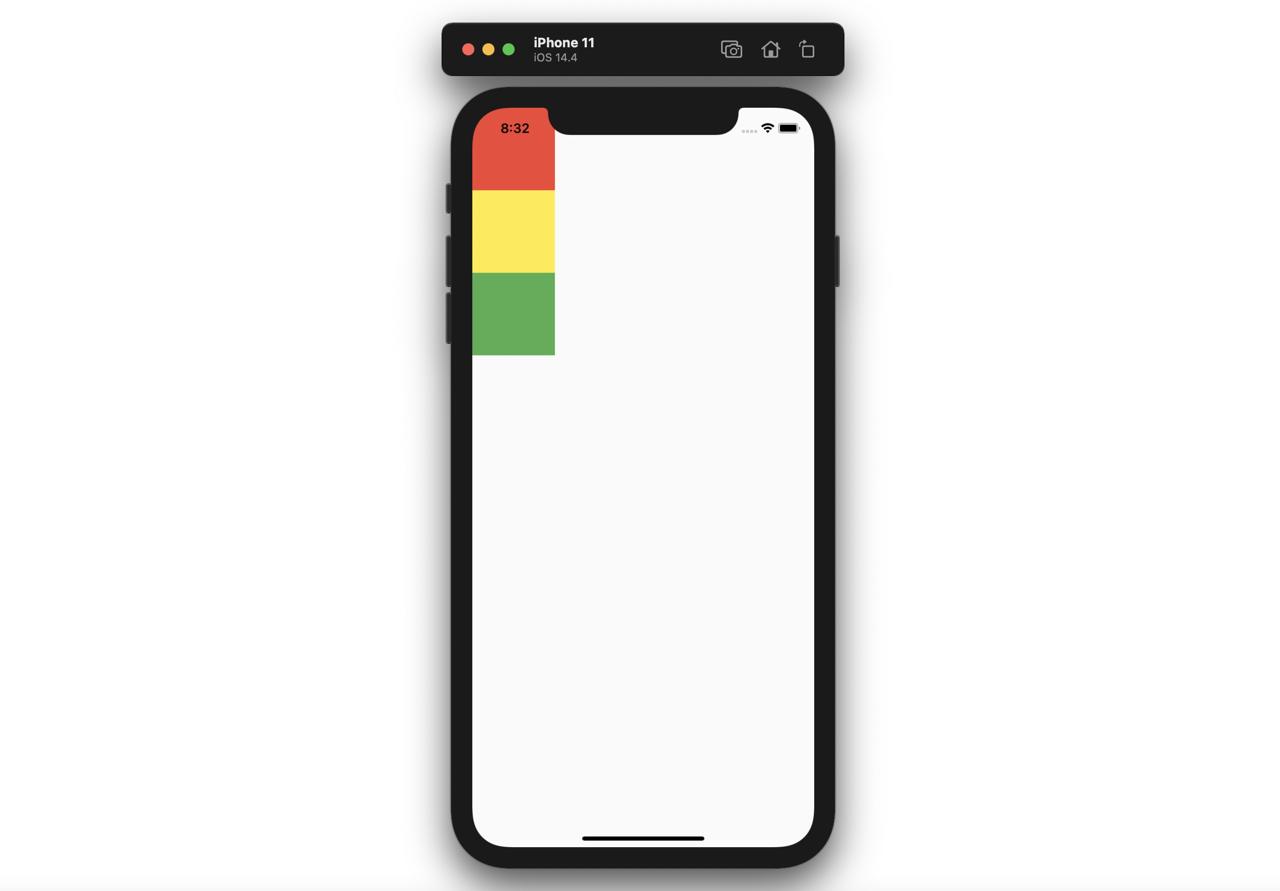
Column과 Row
Flutter에서 화면 레이아웃에 가장 많이 사용되는 Column 위젯과 Row 위젯에 대해서 살펴보도록 하겠습니다.
Column
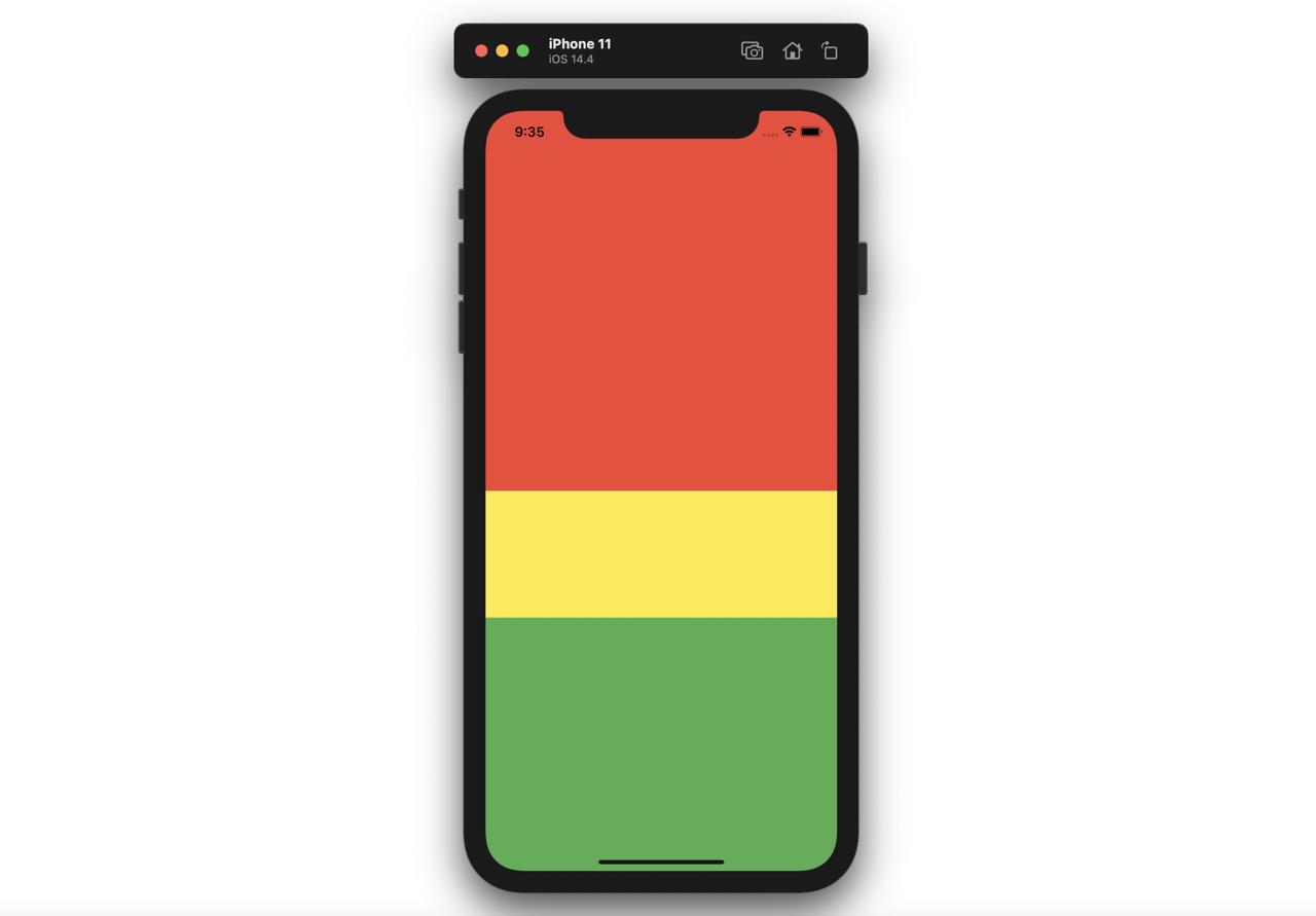
Column 위젯은 자식 위젯들을 세로로 정렬하여 표시합니다. Column 위젯은 세로의 모든 영역을 차지하게 됩니다.
@override
Widget build(BuildContext context) {
  return Scaffold(
    body: Column(
      children: [
        Container(
          width: 100,
          height: 100,
          color: Colors.red,
        ),
        Container(
          width: 100,
          height: 100,
          color: Colors.yellow,
        ),
        Container(
          width: 100,
          height: 100,
          color: Colors.green,
        ),
      ],
    ),
  );
}
위와 같이 Column 위젯은 children으로 전달 받은 위젯들을 다음과 같이 세로로 표시합니다.
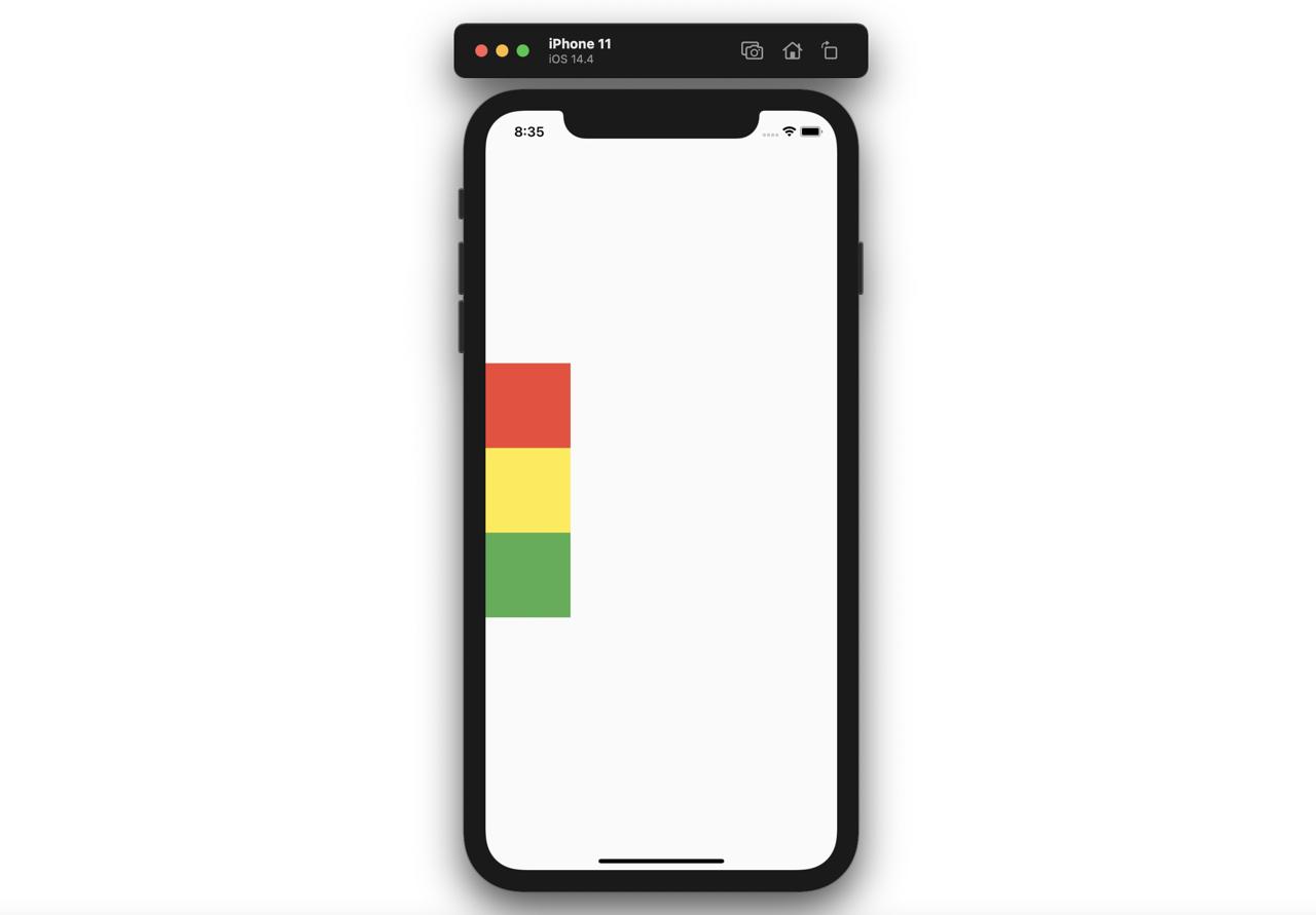
Column의 mainAxisAlignment 파라메터를 이용하면, 자식 위젯들의 정렬을 변경할 수 있습니다.
- center
@override
Widget build(BuildContext context) {
  return Scaffold(
    body: Column(
      mainAxisAlignment: MainAxisAlignment.center,
      children: [
        Container(
          width: 100,
          height: 100,
          color: Colors.red,
        ),
        Container(
          width: 100,
          height: 100,
          color: Colors.yellow,
        ),
        Container(
          width: 100,
          height: 100,
          color: Colors.green,
        ),
      ],
    ),
  );
}
- end
@override
Widget build(BuildContext context) {
  return Scaffold(
    body: Column(
      mainAxisAlignment: MainAxisAlignment.end,
      children: [
        Container(
          width: 100,
          height: 100,
          color: Colors.red,
        ),
        Container(
          width: 100,
          height: 100,
          color: Colors.yellow,
        ),
        Container(
          width: 100,
          height: 100,
          color: Colors.green,
        ),
      ],
    ),
  );
}
- spaceAround
@override
Widget build(BuildContext context) {
  return Scaffold(
    body: Column(
      mainAxisAlignment: MainAxisAlignment.spaceAround,
      children: [
        Container(
          width: 100,
          height: 100,
          color: Colors.red,
        ),
        Container(
          width: 100,
          height: 100,
          color: Colors.yellow,
        ),
        Container(
          width: 100,
          height: 100,
          color: Colors.green,
        ),
      ],
    ),
  );
}
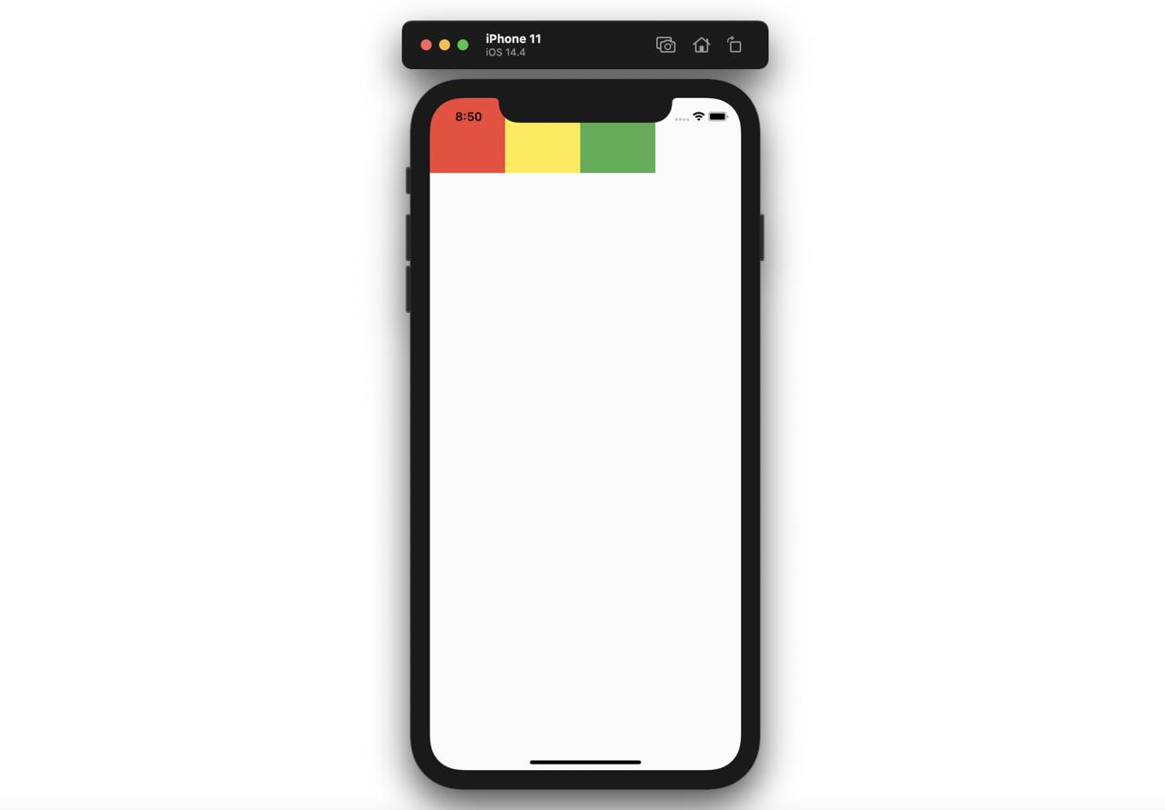
Row
Row 위젯은 자식 위젯들을 가로로 정렬하여 표시합니다. Row 위젯은 가로의 모든 영역을 차지하게 됩니다.
@override
Widget build(BuildContext context) {
  return Scaffold(
    body: Row(
      children: [
        Container(
          width: 100,
          height: 100,
          color: Colors.red,
        ),
        Container(
          width: 100,
          height: 100,
          color: Colors.yellow,
        ),
        Container(
          width: 100,
          height: 100,
          color: Colors.green,
        ),
      ],
    ),
  );
}
위와 같이 Row 위젯은 children으로 전달 받은 위젯들을 다음과 같이 가로로 표시합니다.
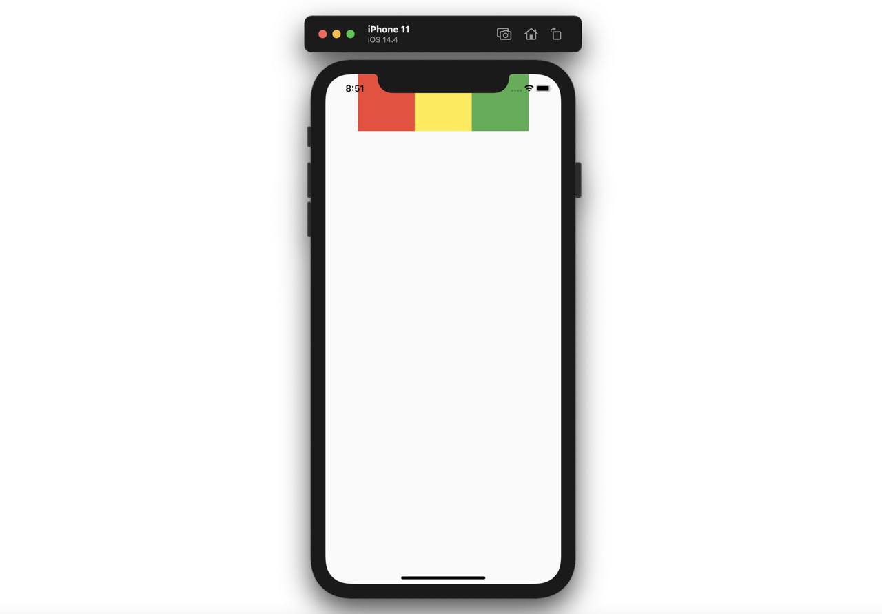
Row의 mainAxisAlignment 파라메터를 이용하면, 자식 위젯들의 정렬을 변경할 수 있습니다.
- center
@override
Widget build(BuildContext context) {
  return Scaffold(
    body: Row(
      mainAxisAlignment: MainAxisAlignment.center,
      children: [
        Container(
          width: 100,
          height: 100,
          color: Colors.red,
        ),
        Container(
          width: 100,
          height: 100,
          color: Colors.yellow,
        ),
        Container(
          width: 100,
          height: 100,
          color: Colors.green,
        ),
      ],
    ),
  );
}
- end
@override
Widget build(BuildContext context) {
  return Scaffold(
    body: Row(
      mainAxisAlignment: MainAxisAlignment.end,
      children: [
        Container(
          width: 100,
          height: 100,
          color: Colors.red,
        ),
        Container(
          width: 100,
          height: 100,
          color: Colors.yellow,
        ),
        Container(
          width: 100,
          height: 100,
          color: Colors.green,
        ),
      ],
    ),
  );
}
- spaceAround
@override
Widget build(BuildContext context) {
  return Scaffold(
    body: Row(
      mainAxisAlignment: MainAxisAlignment.spaceAround,
      children: [
        Container(
          width: 100,
          height: 100,
          color: Colors.red,
        ),
        Container(
          width: 100,
          height: 100,
          color: Colors.yellow,
        ),
        Container(
          width: 100,
          height: 100,
          color: Colors.green,
        ),
      ],
    ),
  );
}
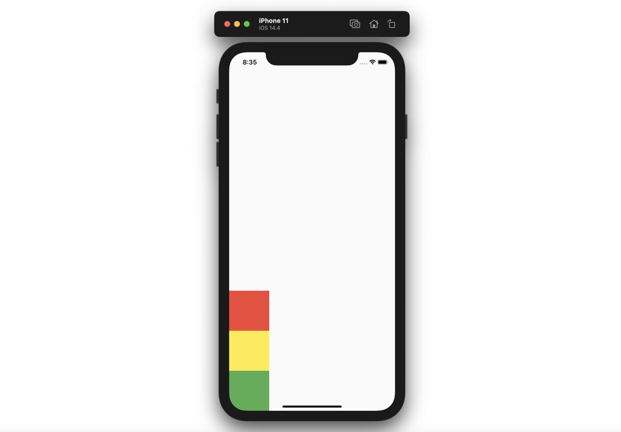
Expanded
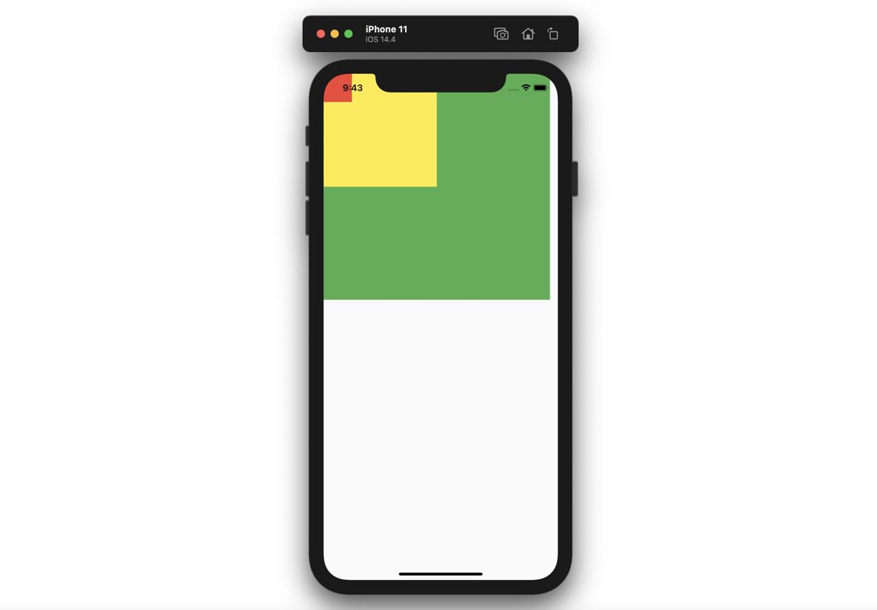
Expanded 위젯은 Column 위젯 또는 Row 위젯과 함께 사용하여 웹 개발에서 사용되는 flex와 같은 기능을 구현할 수 있습니다.
@override
Widget build(BuildContext context) {
  return Scaffold(
    body: Column(
      children: [
        Expanded(
          child: Container(
            color: Colors.red,
          ),
          flex: 3,
        ),
        Expanded(
          child: Container(
            color: Colors.yellow,
          ),
          flex: 1,
        ),
        Expanded(
          child: Container(
            color: Colors.green,
          ),
          flex: 2,
        ),
      ],
    ),
  );
}
위와 같이 Column 위젯의 자식 위젯으로 Expanded 위젯을 사용하고, Expanded 위젯의 flex 파라메터를 사용하면 다음과 같이 웹에서 사용되는 flex와 같은 기능을 구현할 수 있습니다.
Stack
Stack 위젯을 사용하면, 위젯 위에 위젯을 표시할 수 있습니다.
@override
Widget build(BuildContext context) {
  return Scaffold(
    body: Stack(
      children: [
        Container(
          width: 400,
          height: 400,
          color: Colors.green,
        ),
        Container(
          width: 200,
          height: 200,
          color: Colors.yellow,
        ),
        Container(
          width: 50,
          height: 50,
          color: Colors.red,
        ),
      ],
    ),
  );
}
위와 같이 Stack 위젯을 사용하면, 다음과 같이 위젯 위에 위젯이 표시되는 것을 확인할 수 있습니다.
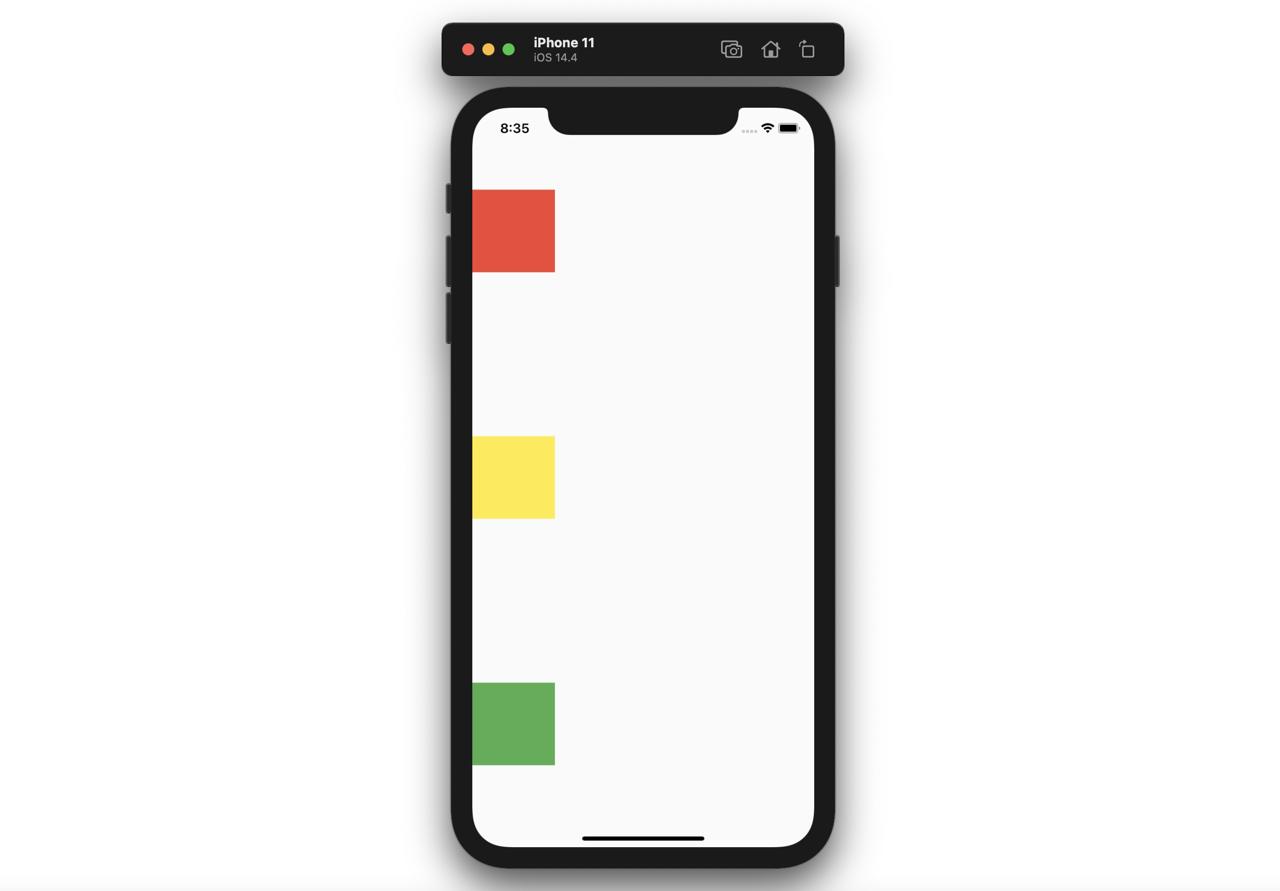
SizedBox
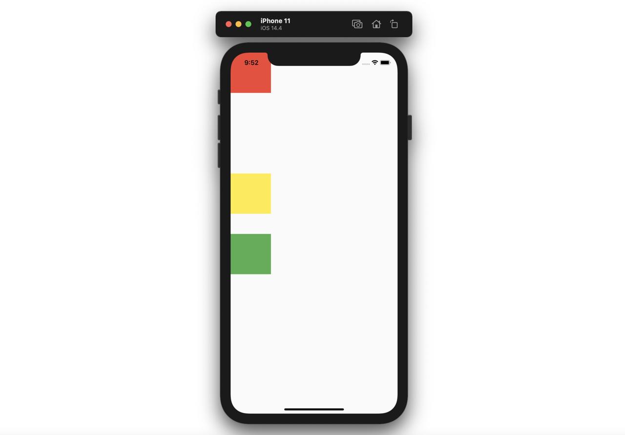
SizedBox 위젯은 위젯과 위젯 사이에 빈 공간을 추가할 때, 자주 사용됩니다.
@override
Widget build(BuildContext context) {
  return Scaffold(
    body: Column(
      children: [
        Container(
          color: Colors.red,
          width: 100,
          height: 100,
        ),
        SizedBox(
          height: 200,
        ),
        Container(
          color: Colors.yellow,
          width: 100,
          height: 100,
        ),
        SizedBox(
          height: 50,
        ),
        Container(
          color: Colors.green,
          width: 100,
          height: 100,
        ),
      ],
    ),
  );
}
위와 같이 Container 위젯과 위젯 사이에 SizedBox 위젯을 추가하면 다음과 같이 빈 공간이 잘 추가되는 것을 확인할 수 있습니다.
완료
이것으로 Flutter에서 자주 사용되는 레이아웃 관련 위젯들을 살펴보았습니다. 이제 이 위젯들을 사용하여 다양하게 레이아웃을 구성해 보시기 바랍니다.
제 블로그가 도움이 되셨나요? 하단의 댓글을 달아주시면 저에게 큰 힘이 됩니다!
앱 홍보
Deku가 개발한 앱을 한번 사용해보세요.Deku가 개발한 앱은 Flutter로 개발되었습니다.관심있으신 분들은 앱을 다운로드하여 사용해 주시면 정말 감사하겠습니다.


