概要
このブログポストではFlutterで画面のレイアウトを担当するウィジェットについて詳しくみてみます。
このブログポストで紹介したソースコどーは下記のリンクで確認できます。
SafeArea
新しい携帯ではアプリ画面を最大利用できるようにデザインされます。iOSのノッチ(Notch)デザインやアンドロイドステータスバーなどアプリが表示されるエリアが拡大しております。
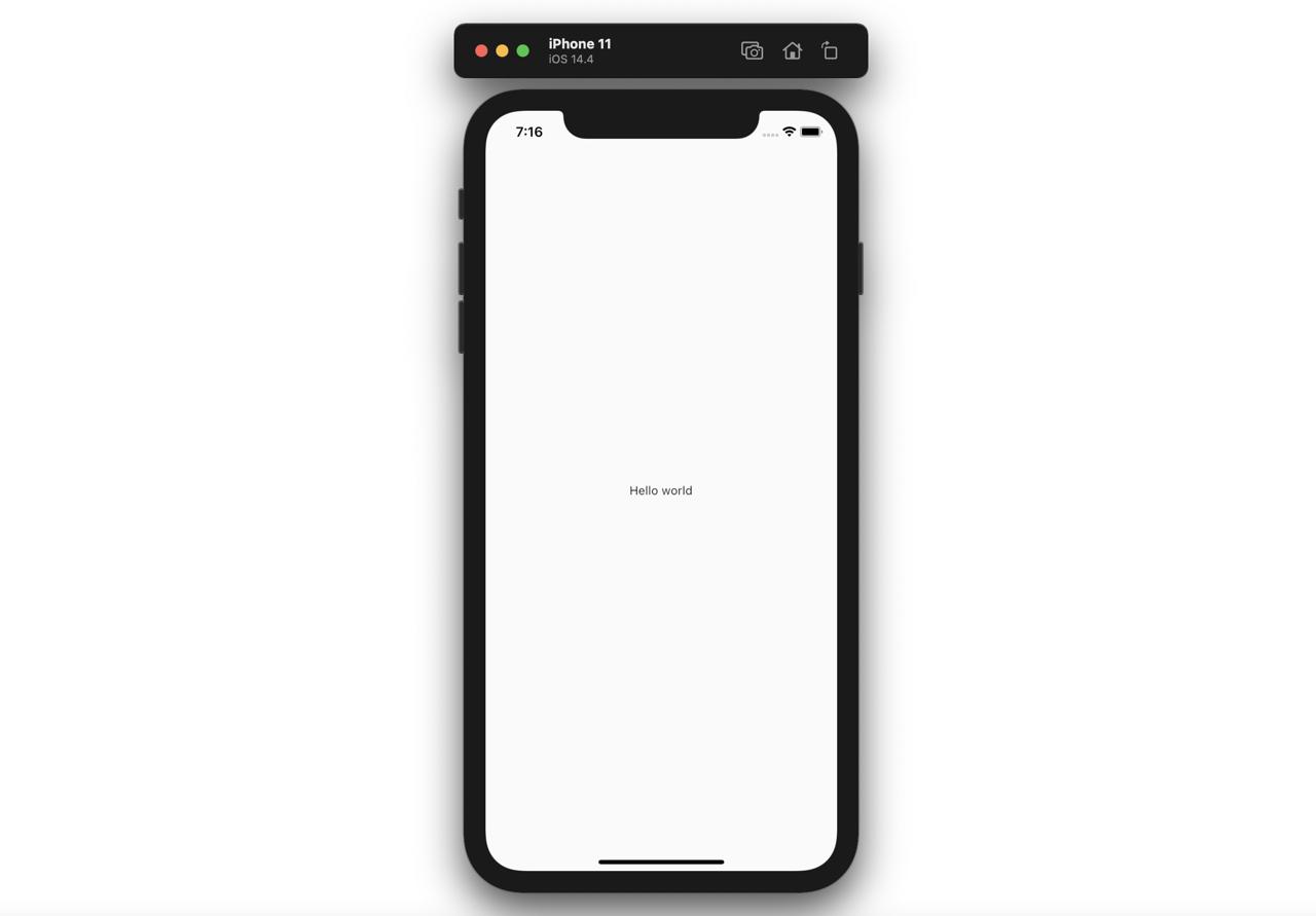
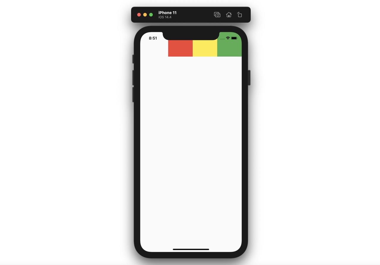
そのせいで、次のようにコードを作成すると、
@override
Widget build(BuildContext context) {
  return Scaffold(
    body: Text('Hello world'),
  );
}
次のようにステータスバーの下にウィジェットが表示される問題が発生します。
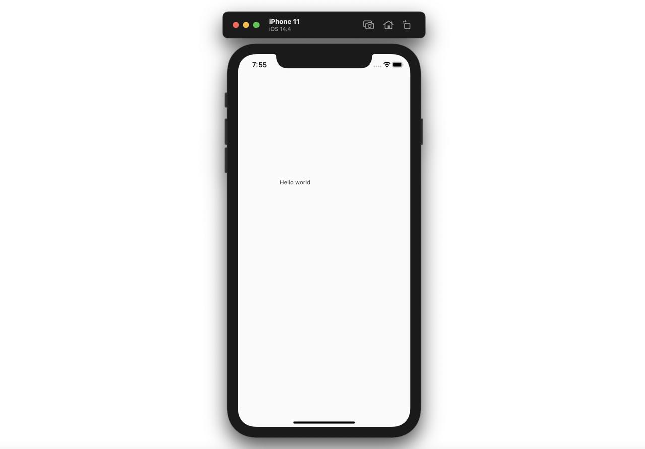
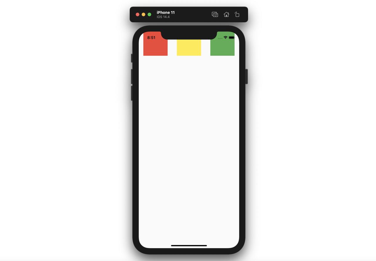
この問題を解決するため、使えるウィジェットがSafeAreaです。SafeAreaは下記のように使えます。
@override
Widget build(BuildContext context) {
  return Scaffold(
    body: SafeArea(
      child: Text('Hello world'),
    ),
  );
}このようにSafeAreaを使うと次のようにステータスバー以外のエリアにウィジェットが表示されます。

Center
Centerウィジェットはチャイルドウィジェットを真ん中へ表示します。
@override
Widget build(BuildContext context) {
  return Scaffold(
    body: Center(
      child: Text('Hello world'),
    ),
  );
}このようにCenterウィジェットのチャイルドウィジェットにTextを渡すと、次のように真ん中に表示されることが確認できます。
Padding
Paddingウィジェットはチャイルドウィジェットにpaddingを表示します。
@override
Widget build(BuildContext context) {
  return Scaffold(
    body: Padding(
      child: Text('Hello world'),
      padding: EdgeInsets.fromLTRB(100.0, 300.0, 10.0, 40.0),
    ),
  );
}このようにPaddingウィジェットにチャイルドウィジェットを入れて、paddingの値を設定するとチャイルドウィジェットがPaddingと一緒に表示されます。
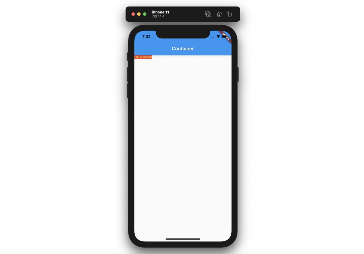
Container
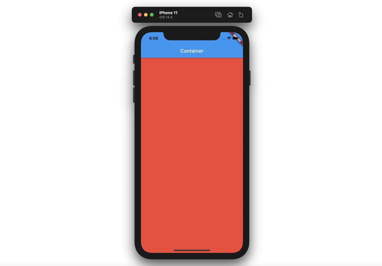
Containerウィジェットを使うと基本的最大の空間を占めて表示されます。
@override
Widget build(BuildContext context) {
  return Scaffold(
    appBar: AppBar(
      title: Text('Container'),
    ),
    body: Container(
      color: Colors.red,
    ),
  );
}
このようにContainerを表示すると、次のように最大空間(画面の全て)に表示されます。
もし、Containerへチャイルドウィジェットがセットされると、Containerはチャイルドウィジェットのサイズで表示されます。
@override
Widget build(BuildContext context) {
  return Scaffold(
    appBar: AppBar(
      title: Text('Container'),
    ),
    body: Container(
      color: Colors.red,
      child: Text(
        'Hello world',
        style: TextStyle(color: Colors.yellow),
      ),
    ),
  );
}
このようにContainerにチャイルドウィジェットを指定すると次のようにContainerはチャイルドウィジェットのサイズで表示されます。
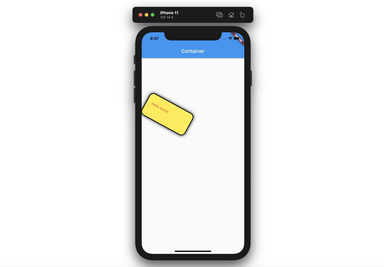
ContainerはPaddingとは違って次のように色んなパラメータを使うことができます。
@override
Widget build(BuildContext context) {
  return Scaffold(
    appBar: AppBar(
      title: Text('Container'),
    ),
    body: Container(
      child: Text(
        'Hello world',
        style: TextStyle(color: Colors.red),
      ),
      padding: EdgeInsets.fromLTRB(20.0, 30.0, 40.0, 50.0),
      margin: EdgeInsets.all(100.0),
      width: 200,
      height: 100,
      transform: Matrix4.rotationZ(0.5),
      decoration: BoxDecoration(
        color: Colors.yellow,
        border: Border.all(color: Colors.black, width: 3),
        borderRadius: BorderRadius.all(Radius.circular(18)),
        boxShadow: const [
          BoxShadow(blurRadius: 10),
        ],
      ),
    ),
  );
}
このように色んなパラメータを使うと次のようにパラメータが適用されたContainerウィジェットが表示されます。
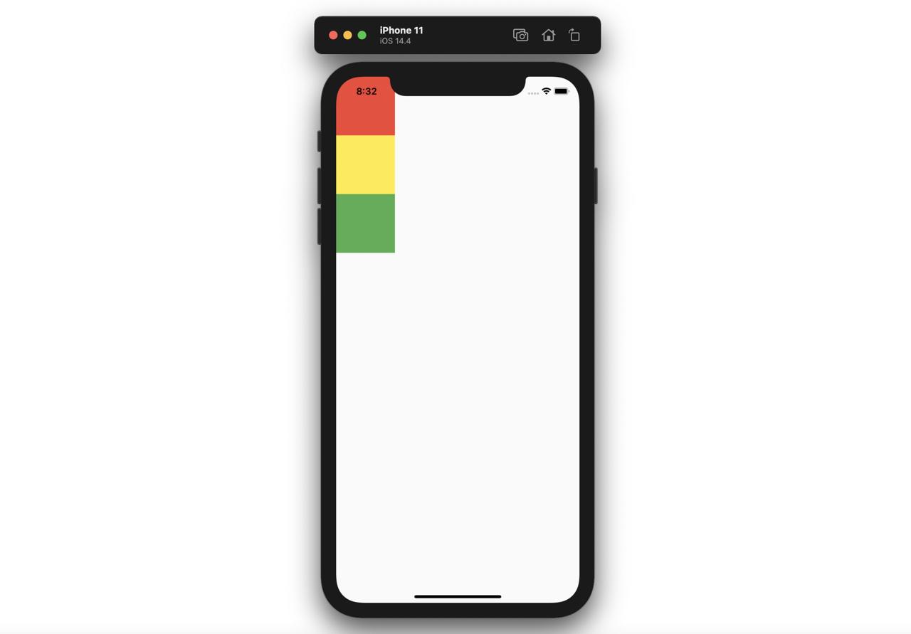
ColumnとRow
Flutterで画面のレイアウトを作るとき一番使ってるColumnウィジェットとRowウィジェットについて説明します。
Column
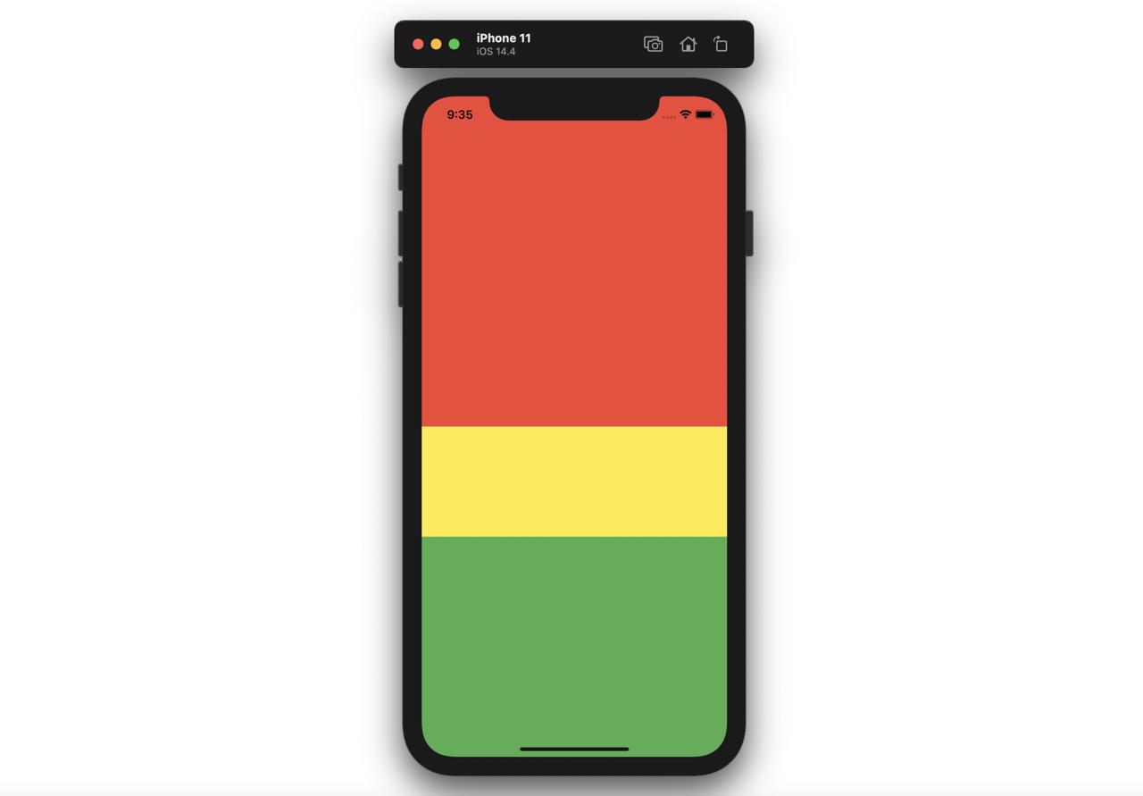
Columnウィジェットはチャイルドウィジェットを縦に並べて表示します。Columnウィジェットは縦の全てのエリアを占めて表示されます。
@override
Widget build(BuildContext context) {
  return Scaffold(
    body: Column(
      children: [
        Container(
          width: 100,
          height: 100,
          color: Colors.red,
        ),
        Container(
          width: 100,
          height: 100,
          color: Colors.yellow,
        ),
        Container(
          width: 100,
          height: 100,
          color: Colors.green,
        ),
      ],
    ),
  );
}上のようにColumnウィジェットはchildrenでもらったウィジェットを次のように縦で表示します。
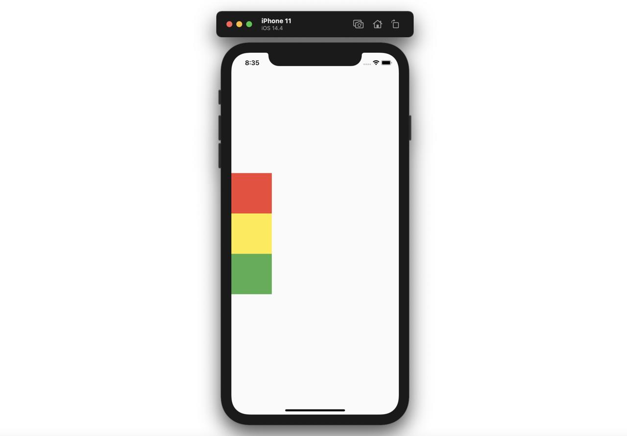
ColumnのmainAxisAlignmentパラメータを使うと、チャイルドウィジェットの並び替えることができます。
- center
@override
Widget build(BuildContext context) {
  return Scaffold(
    body: Column(
      mainAxisAlignment: MainAxisAlignment.center,
      children: [
        Container(
          width: 100,
          height: 100,
          color: Colors.red,
        ),
        Container(
          width: 100,
          height: 100,
          color: Colors.yellow,
        ),
        Container(
          width: 100,
          height: 100,
          color: Colors.green,
        ),
      ],
    ),
  );
}
- end
@override
Widget build(BuildContext context) {
  return Scaffold(
    body: Column(
      mainAxisAlignment: MainAxisAlignment.end,
      children: [
        Container(
          width: 100,
          height: 100,
          color: Colors.red,
        ),
        Container(
          width: 100,
          height: 100,
          color: Colors.yellow,
        ),
        Container(
          width: 100,
          height: 100,
          color: Colors.green,
        ),
      ],
    ),
  );
}
- spaceAround
@override
Widget build(BuildContext context) {
  return Scaffold(
    body: Column(
      mainAxisAlignment: MainAxisAlignment.spaceAround,
      children: [
        Container(
          width: 100,
          height: 100,
          color: Colors.red,
        ),
        Container(
          width: 100,
          height: 100,
          color: Colors.yellow,
        ),
        Container(
          width: 100,
          height: 100,
          color: Colors.green,
        ),
      ],
    ),
  );
}
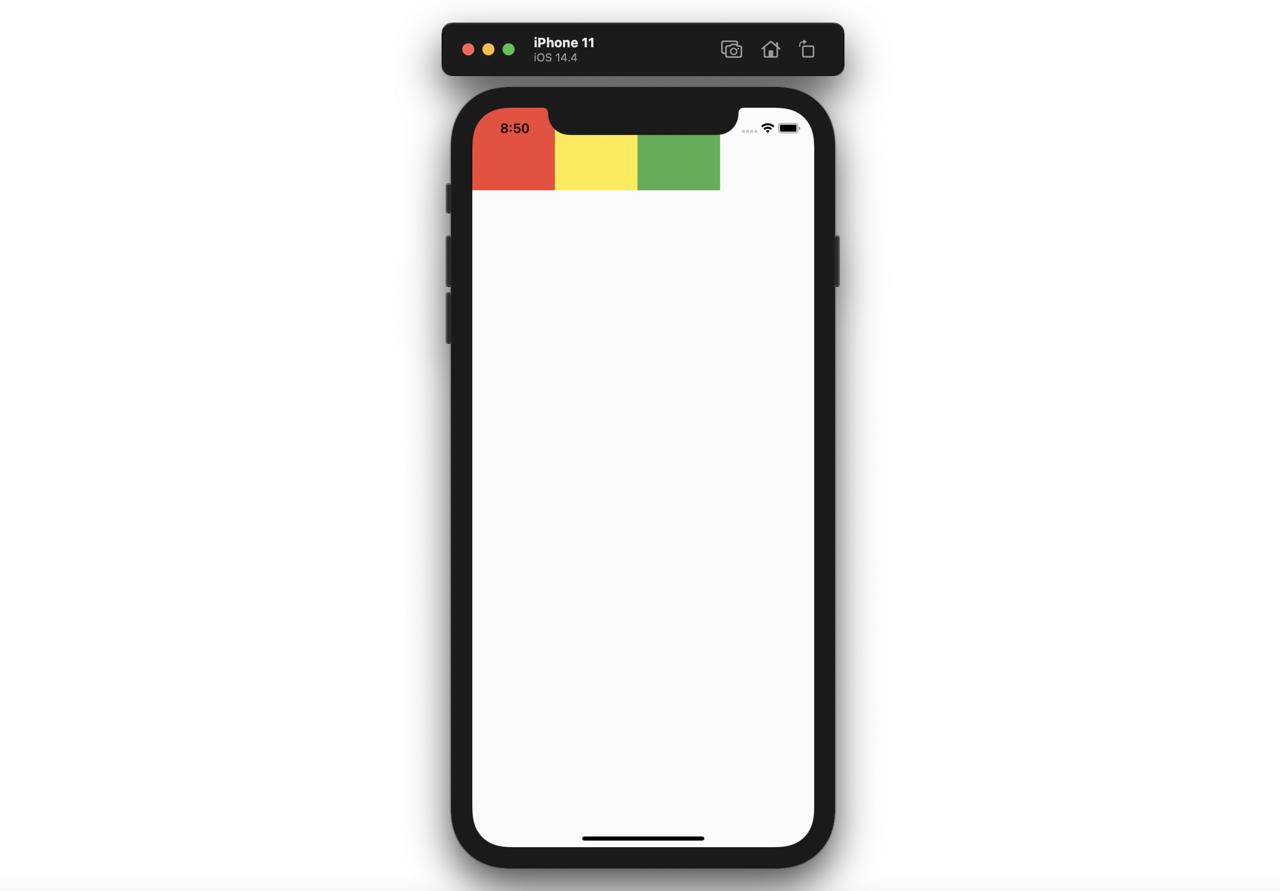
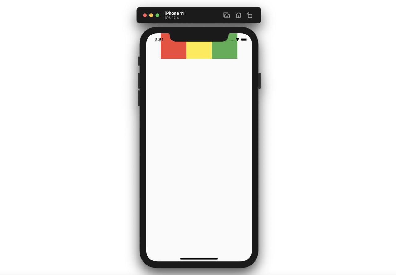
Row
Rowウィジェットはチャイルウィジェットを横に並べて表示します。Rowウィジェットは横のエリアを占めて表示されます。
@override
Widget build(BuildContext context) {
  return Scaffold(
    body: Row(
      children: [
        Container(
          width: 100,
          height: 100,
          color: Colors.red,
        ),
        Container(
          width: 100,
          height: 100,
          color: Colors.yellow,
        ),
        Container(
          width: 100,
          height: 100,
          color: Colors.green,
        ),
      ],
    ),
  );
}上のようにRowウィジェットはchildrenでもらったウィジェットを次のように横に表示します。
RowのmainAxisAlignmentパラメータを使うと、チャイルドウィジェットを並び替えることができます。
- center
@override
Widget build(BuildContext context) {
  return Scaffold(
    body: Row(
      mainAxisAlignment: MainAxisAlignment.center,
      children: [
        Container(
          width: 100,
          height: 100,
          color: Colors.red,
        ),
        Container(
          width: 100,
          height: 100,
          color: Colors.yellow,
        ),
        Container(
          width: 100,
          height: 100,
          color: Colors.green,
        ),
      ],
    ),
  );
}
- end
@override
Widget build(BuildContext context) {
  return Scaffold(
    body: Row(
      mainAxisAlignment: MainAxisAlignment.end,
      children: [
        Container(
          width: 100,
          height: 100,
          color: Colors.red,
        ),
        Container(
          width: 100,
          height: 100,
          color: Colors.yellow,
        ),
        Container(
          width: 100,
          height: 100,
          color: Colors.green,
        ),
      ],
    ),
  );
}
- spaceAround
@override
Widget build(BuildContext context) {
  return Scaffold(
    body: Row(
      mainAxisAlignment: MainAxisAlignment.spaceAround,
      children: [
        Container(
          width: 100,
          height: 100,
          color: Colors.red,
        ),
        Container(
          width: 100,
          height: 100,
          color: Colors.yellow,
        ),
        Container(
          width: 100,
          height: 100,
          color: Colors.green,
        ),
      ],
    ),
  );
}
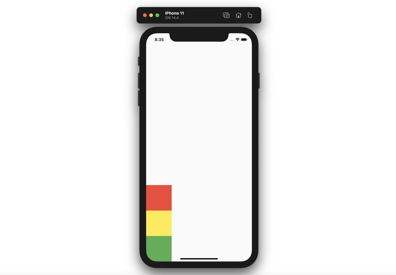
Expanded
ExpandedウィジェットはColumnウィジェットまたはRowウィジェットと一緒に使うとウェブ開発で使えるflexと同じ機能を実装することができます。
@override
Widget build(BuildContext context) {
  return Scaffold(
    body: Column(
      children: [
        Expanded(
          child: Container(
            color: Colors.red,
          ),
          flex: 3,
        ),
        Expanded(
          child: Container(
            color: Colors.yellow,
          ),
          flex: 1,
        ),
        Expanded(
          child: Container(
            color: Colors.green,
          ),
          flex: 2,
        ),
      ],
    ),
  );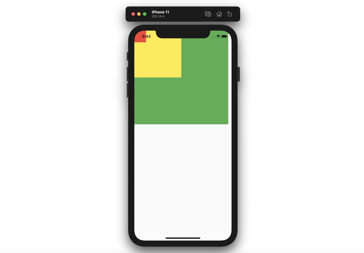
}上のようにColumnウィジェットのチャイルドウィジェットでExpandedウィジェットを使って、Expandedウィジェットのflexパラメータを使うと次のようにウェブで使えるflexと同じ機能を実装することができます。
Stack
Stackウィジェットを使うと、ウィジェットの上にウィジェットを表示することができます。
@override
Widget build(BuildContext context) {
  return Scaffold(
    body: Stack(
      children: [
        Container(
          width: 400,
          height: 400,
          color: Colors.green,
        ),
        Container(
          width: 200,
          height: 200,
          color: Colors.yellow,
        ),
        Container(
          width: 50,
          height: 50,
          color: Colors.red,
        ),
      ],
    ),
  );
}
上のようにStackウィジェットを使うと、次のようにウィジェットの上にウィジェットを表示することができます。
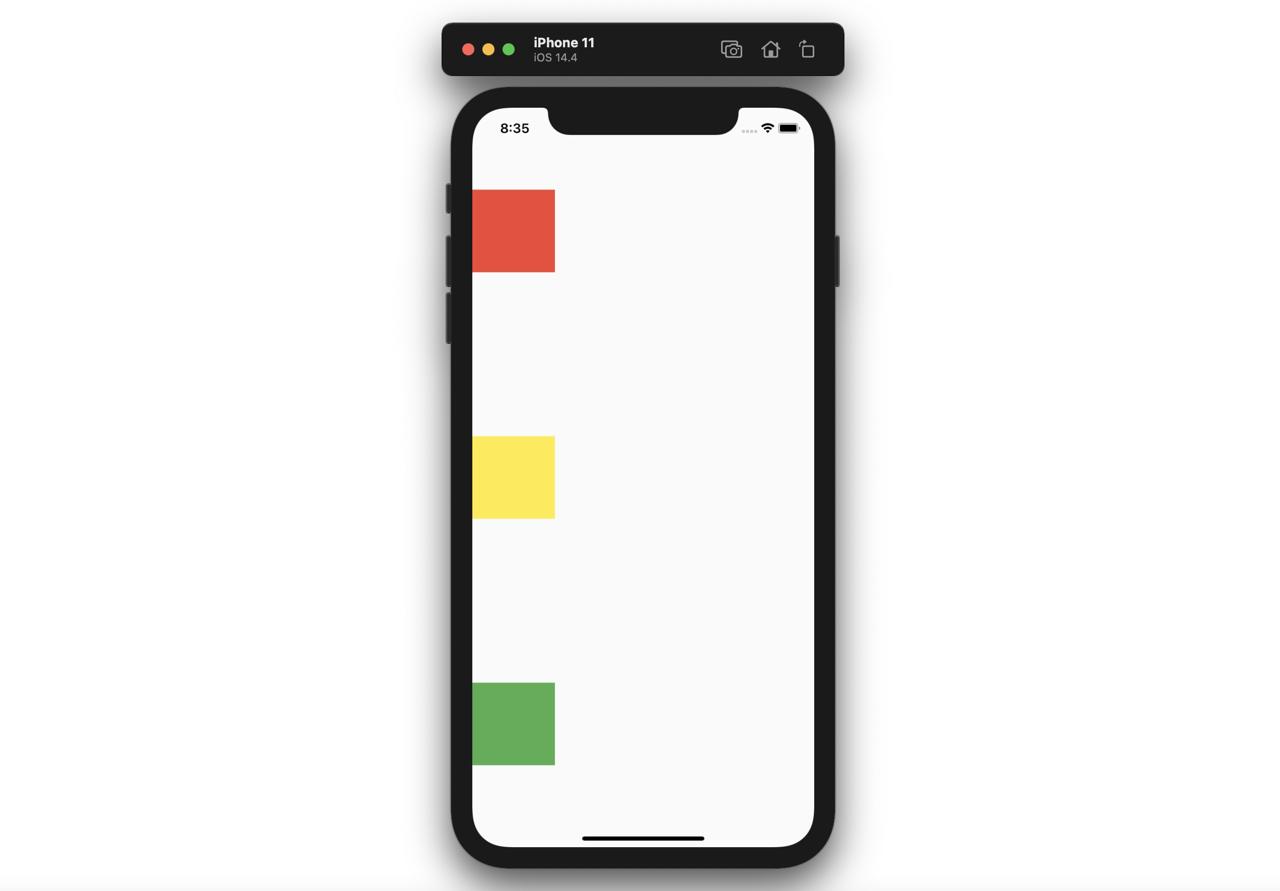
SizedBox
SizedBoxウィジェットはウィジェットとウィジェットの間に空きスペースを入れる時、よく使えます。
@override
Widget build(BuildContext context) {
return Scaffold(
body: Column(
children: [
Container(
color: Colors.red,
width: 100,
height: 100,
),
SizedBox(
height: 200,
),
Container(
color: Colors.yellow,
width: 100,
height: 100,
),
SizedBox(
height: 50,
),
Container(
color: Colors.green,
width: 100,
height: 100,
),
],
),
);
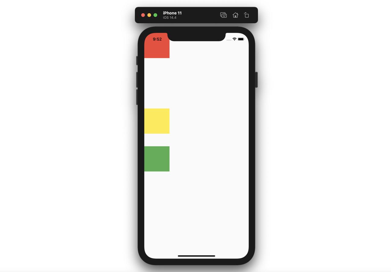
}上のようにContainerウィジェットとウィジェットの間にSizedBoxウィジェットを追加すると下記のように空きスペースが追加されることが確認できます。
完了
これでFlutterでよく使えるレイアウト関連ウィジェットをみてみました。今からはこのウィジェットを使って色んなレイアウトを構成してみてください。
私のブログが役に立ちましたか?下にコメントを残してください。それは私にとって大きな大きな力になります!
アプリ広報
Dekuが開発したアプリを使ってみてください。Dekuが開発したアプリはFlutterで開発されています。興味がある方はアプリをダウンロードしてアプリを使ってくれると本当に助かります。